- Grow Newsie
- Posts
- Formatting a Newsletter: Style Tips to Boost Engagement
Formatting a Newsletter: Style Tips to Boost Engagement
Learn expert strategies for formatting a newsletter that stands out. Improve design and layout to increase reader engagement and clicks.
Nikhil Wad
May 29, 2025
Good newsletter formatting is more than just making things look pretty; it's about creating a reading experience that feels natural and easy for your subscribers. When people can smoothly scan and understand your content, they're much more likely to engage with and appreciate what you send. In a busy inbox, how your newsletter is structured and presented can make the difference between being read or being deleted, making these basics very important for success.
How readers see and process information is crucial, which makes visual hierarchy a big part of formatting a newsletter. Using things like strong headlines, clear subheadings, plenty of white space, and fitting images helps guide the reader's eye through your content. This ensures your main points get noticed instead of being buried in a lot of text, showing respect for your reader's time. Also, consistent branding in your newsletter design—using the same colors, fonts, and logo placement—is key for building recognition and subscriber trust. When subscribers quickly recognize your brand in their inbox, they are more inclined to open and read your emails regularly.
The way you format your newsletter can directly affect how your audience interacts with it. For example, your choice of layout can really change open and engagement rates. This infographic shows how different layout choices affect reader engagement by comparing open rates of common newsletter structures.
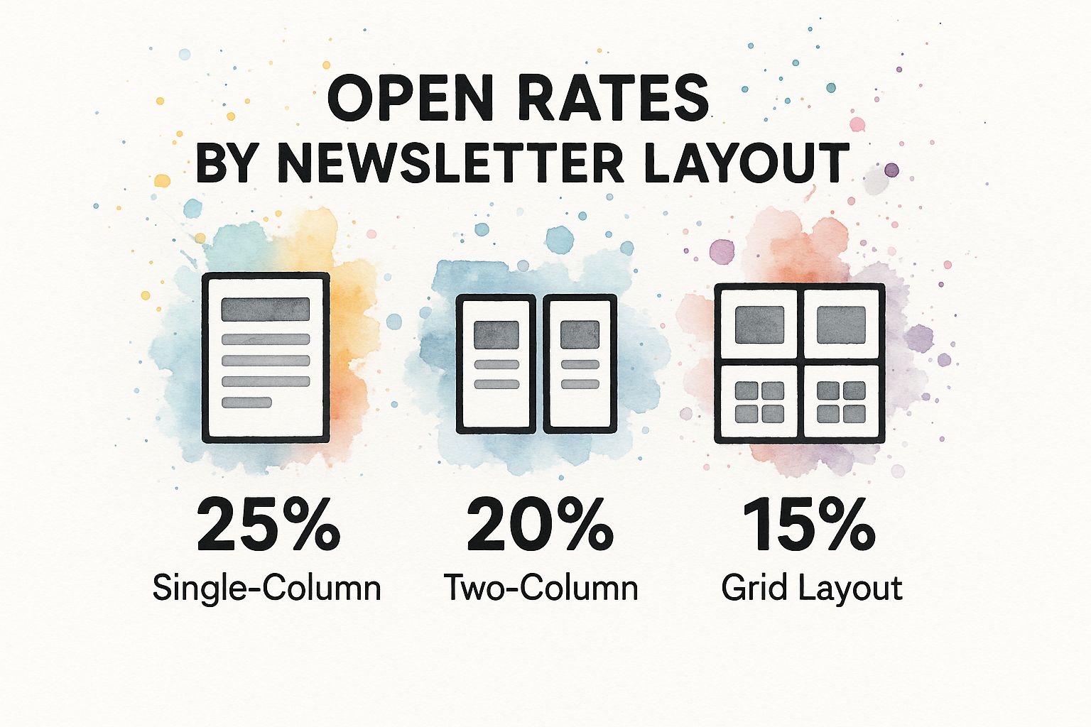
The data here suggests that simpler, single-column layouts often see better engagement (a 25% open rate in the example). This is likely because they are easier to read, especially on mobile phones. Such decisions show how basic formatting choices directly help your newsletter perform better.
Thinking of starting a newsletter?
I’ve partnered with the beehiiv team to set you up with:
✅ 20% off your first 3 months
✅ A free 30-day trial, no credit card needed
It’s packed with features that make creating great content easier: AI tools that save time, landing pages that convert better, and a built-in ad network to help you earn more.

Creating a distinct visual identity is fundamental to memorable newsletter formatting. This means choosing a consistent color scheme, fonts that match your brand's personality, and an image style that connects with your readers. Think of it as your newsletter's unique signature, making it instantly identifiable. With the worldwide email user count hitting an impressive 4.48 billion in 2024, and forecasts showing it could pass 4.8 billion by 2027, your newsletter needs a unique look to get noticed. Proper newsletter formatting helps grab attention and makes reading easier for this large and varied audience, ensuring your message is not just sent, but also seen and valued. Find more detailed statistics here
Setting Cross-Platform Formatting Standards
After you've set up your visual identity, the next important step is to create formatting standards that work well across various email clients and devices. Email services, from Outlook and Gmail to Apple Mail, can interpret HTML and CSS differently. This can cause annoying display problems if you don't plan for it during the design stage. As a result, something that looks great in your tests might look messy or disorganized for some of your readers.
To help you understand how formatting features are handled by different email platforms, the table below compares key aspects.
Email Client Formatting Compatibility Comparison of formatting features supported across major email clients
Email Client | CSS Support | Image Display | Mobile Optimization | Custom Fonts |
|---|---|---|---|---|
Gmail | Good | Reliable (user enabled) | Excellent | Good (with fallbacks) |
Outlook (Desktop) | Limited (especially older versions) | Blocks by default (user can enable) | Fair (improving) | Limited (web-safe recommended) |
Apple Mail | Excellent | Reliable | Excellent | Excellent (with fallbacks) |
Yahoo Mail | Good | Reliable (user enabled) | Good | Decent (with fallbacks) |
This table shows that while some clients like Apple Mail offer robust support for various formatting elements, others, particularly older desktop versions of Outlook, can be more restrictive. Testing across multiple clients is crucial.
To make sure everyone has a consistent experience when formatting a newsletter, think about these important practices for wide compatibility:
Choose single-column layouts, as they are generally stronger and adjust more consistently to mobile screens. These layouts usually cause fewer display problems.
Use web-safe fonts like Arial, Helvetica, or Times New Roman. If you use custom fonts, make sure to specify suitable fallback fonts.
Keep your design simple and steer clear of very complex HTML, as this is more likely to break or display oddly on different email platforms.
You might find it helpful to learn more about choosing the perfect newsletter layoutto see how you can optimize for different platforms. In the end, well-thought-out formatting standards are key to providing a good reading experience for every subscriber, no matter what device or email client they use.
Creating Visual Hierarchy That Guides Reader Flow

Once you have consistent standards in place, the next important aspect of formatting a newsletter well is understanding visual hierarchy. This design idea involves arranging different parts of your newsletter to show what's most important. It helps guide your reader’s eyes smoothly through your content, making your newsletter easy to read and interesting.
The Power of Headlines and Subheadings
Using headlines and subheadings well is a big part of good visual hierarchy. Compelling headlines are your first opportunity to catch your reader's eye. Think of them as signs that tell people what each part of your newsletter covers. Good headlines are clear, short, and interesting; for example, one that offers a fix for a common issue usually works better than a vague one.
After strong headlines, subheadings are very helpful for breaking your content into smaller, easy-to-read pieces. They help create a clear flow, so subscribers can quickly scan your newsletter and pick out what matters most to them. Since many people skim emails, good subheadings make sure your main points stand out, which greatly helps when formatting a newsletter to be easily scannable.
Typography, Color, and Spacing: The Building Blocks of Scannability
Besides headings, how you use typography, color, and spacing is key to a newsletter that looks good and is easy to read. Making thoughtful typography choices is essential when formatting a newsletter so people can read it without trouble. This includes:
Font Selection: Pick fonts that are comfortable to read. Custom fonts can show personality, but always have web-safe fallbacks ready because email programs handle fonts differently. Sans-serif fonts like Arial or Helvetica are popular for screens because they are clean and clear.
Size Variations: Use different font sizes for your main headlines, subheadings, regular text, and image captions. This makes the visual structure clear and helps readers quickly see how important each piece of information is.
Contrast Ratios: Make sure there's enough contrast between your text color and background color. A good rule of thumb is a minimum contrast ratio of 4.5:1 for normal text, as suggested by web accessibility guidelines. This makes a big difference in readability, especially for people with vision difficulties or those reading on screens in bright light.
Your color scheme also plays a big role in visual hierarchy and helping people remember your brand. Use colors with purpose, perhaps to make calls-to-action (CTAs), links, or key information stand out. Try not to use too many bright or clashing colors, as this can be distracting. Using your brand colors consistently helps people recognize your brand. This smart use of color helps when formatting a newsletter to direct the reader's attention.
Good spacing, also known as white space, is just as important. Plenty of margins, space around different elements, and good line height stop your content from looking squished and hard to read. White space lets your content breathe, making it look neater and more welcoming. This can help readers stay focused on your message longer without getting tired.
Balancing Text and Visuals for Maximum Impact
Text carries your main message, but visuals like images, GIFs, or simple charts can make your newsletter more engaging if you find the right balance. When formatting a newsletter, your aim is for visuals to support your text, not to take attention away from your main ideas. For instance, a well-chosen image can break up a large block of text, explain a tricky idea simply, or add feeling to your message.
But, too many large images can make your newsletter load slowly, particularly on phones, and might drown out your message. Aim for a good mix where visuals are relevant, clear, and the right size. For example, putting an interesting image after an important opening paragraph can pull readers deeper into your content. This careful balance helps make sure your most important messages are noticed and understood, making your newsletter work better.
Getting these parts of visual hierarchy right is key for formatting a newsletter that grabs attention and is also enjoyable and easy to read. When you guide your readers through your content thoughtfully, they are more likely to understand your message and do what you hope they’ll do. This leads to better results for your newsletter.
Standing Out In A Crowded Email Landscape
Getting your newsletter noticed is tough when inboxes are overflowing. To grab and keep your readers' attention, your approach to formatting a newsletter must be smart and unique. Good design choices can make your content stand out and help you build real connections with your subscribers.
Beyond Standard Templates: Differentiating Your Design
It's easy for newsletters to look the same, causing them to get lost in the shuffle. To make yours different, think about how special layouts can set it apart. You don't need extremely complicated designs; instead, make careful choices that avoid a boring look. Small changes like different column sizes, surprising spots for images, or new ways to divide sections can make your newsletter formatting feel new and purposeful.
This way of thinking isn't just about using a template; it's about creating an experience for your readers. When people see a design that is clearly unique and well-thought-out, it shows you put in effort and care. This can make them want to read more of what you have to say. The aim is for your newsletter to be easy to spot and nice to look at every time it arrives.
Strategic Visuals and The Art of White Space
Good visuals do more than just look nice; they are strong tools for making your newsletter effective. Instead of using common stock photos, consider how special graphics, distinct illustrations, or well-selected photos can support your brand and what you want to say. These images should fit well with your words, catch the reader's attention, and make your message clearer or more attractive.
In the same way, strategic white space is a very important, but often forgotten, part of design. It's not just empty space; it actively helps by making text easier to read, highlighting key points, and preventing the design from feeling too crowded. Plenty of white space around your words and pictures can make your newsletter seem cleaner and more welcoming, helping readers concentrate better.
The huge amount of digital messages shows why this is so important. Email use keeps growing, proving that newsletters are still a key way people communicate and businesses market. Globally, the number of emails sent and received daily hit 319.6 billion in 2021, which was a 4.3% increase from the year before. This growth has sped up: in 2024, the newsletter platform beehiiv shared that it sent 15.6 billionemails, a big jump from 4.5 billion in 2023. That's more than a threefold increase in just one year! With so many emails, your newsletter's design, layout, and how well it works on phones are crucial for getting noticed and keeping subscribers interested. You can find more email statistics to guide your strategy.
Marrying Creativity with Clear Functionality
Having a unique visual style is important, but it must work alongside a professional look and smooth operation. Even the most imaginative newsletter design won't succeed if it’s hard to read or confusing to navigate. Your design choices should improve the reader's experience, not make it worse.
This means making sure your layouts, even the really creative ones, adapt well and look right on various email platforms and devices. Important things to think about are:
Font choices that look good and are easy to read.
Color schemes that match your brand and also provide enough contrast so everyone can read them.
Interactive features, if you use them, that are easy to understand and don’t make the newsletter load slowly.
In the end, the best newsletters achieve a great balance: their unique design grabs attention, and their perfect performance keeps readers interested. This careful mix of creativity and function in how you format your newsletter is what helps turn your design work into real connections with your audience.

It's a plain fact that many people will see your newsletter on their phone first. Research shows that mobile opens make up over 50% of all email opens. This number clearly shows why a mobile-first way of thinking is essential when formatting a newsletter. Your design should start with mobile in mind, not add it as a later fix.
Putting the mobile experience first means your content is easy to read and use on small screens. This design style also works well on tablets and desktops, giving everyone a good experience. Using responsive design methods is important to make your newsletter look great, no matter if it's on a small phone or a large computer screen.
Key Considerations for Mobile-Friendly Formatting
To get mobile-first newsletter design right, you need to pay close attention to a few important parts. For instance, touch-friendly buttons are a must. Buttons should be big enough and have enough space around them so people can tap them easily with a finger, without tapping something else by mistake. A common guideline suggests a minimum tap target size of 44x44 pixels.
Also, readable font scaling is very important. Text that looks good on a desktop might be too small to read on a mobile phone. Make sure your fonts adjust properly so people can read them without needing to zoom in. Think about using font sizes of at least 14-16px for body text on mobile. Image optimization is another key point; big, uncompressed images can make your newsletter load slowly, which can be annoying for mobile users with slower internet. Making images smaller and using responsive image methods helps your pictures load fast and not use too much data.
Common Mobile Formatting Pitfalls and Solutions
Some common mistakes can make your newsletter hard to use on mobile devices. A frequent problem is text that's too tiny or columns that don't stack right, forcing users to scroll sideways – a big frustration on mobile. Another issue is buttons or links placed too close together, making them hard to tap correctly.
To prevent these issues when formatting a newsletter for mobile:
Use a single-column layout: This is the safest setup for mobile. Content naturally flows down the screen, fitting well on different screen sizes.
Implement responsive design: Use CSS media queries to change the layout, font sizes, and image sizes based on the screen of the device being used.
Ensure adequate spacing: Add enough space around text, images, and especially buttons and links to make them clear and easy to tap.
Optimize images: Make image files smaller for quicker loading. Think about using
srcsetattributes for images that adjust their size for different screen qualities.
You can find more information in our article about optimizing your email newsletters for search engines and user experience, which covers related topics that help with overall newsletter quality.
Testing Your Mobile Design Before Sending
No matter how well you plan your mobile-friendly newsletter, thorough testing is absolutely necessary. What appears perfect in your design tool might look different on various mobile phones and email programs because they don't all handle HTML and CSS the same way. So, checking your newsletter on actual devices – both iOS and Android – is a vital step before you send it out.
Think about using email testing tools. These tools can show you how your newsletter will look in many different email programs and on various devices. This checking step helps you find and fix any display problems before your newsletter goes to your subscribers, making sure everyone has a good reading experience.
To help you keep track of these important details when formatting a newsletter, here's a straightforward checklist:
Mobile Optimization Checklist Essential mobile formatting requirements and best practices
Element | Mobile Requirement | Desktop Standard | Impact on Engagement |
|---|---|---|---|
Layout | Single-column, responsive | Flexible (multi-column common) | High (prevents scrolling issues) |
Font Size (Body) | Minimum 14-16px | 12-14px | High (improves readability) |
Buttons/CTAs | Minimum 44x44px tap target, well-spaced | Smaller, denser placement acceptable | High (eases interaction) |
Images | Optimized file size, responsive | Larger files acceptable | Medium (impacts load time) |
Line Length | Approx. 40-60 characters | Up to 75 characters | Medium (aids scannability) |
Preheader Text | Concise and engaging, visible on mobile | Important | Medium (influences open rates) |
Using this checklist can help you focus on what matters most for your mobile readers and make sure your newsletters are effective.
By following these mobile-first ideas when formatting a newsletter, you serve the needs of most of your readers and greatly increase the likelihood that your content will be read and acted upon. A smooth mobile experience is not just a nice extra; it's a basic need for newsletter success.
Adding Personalization And Interactive Elements
Making sure your newsletter looks great on phones is important, but that's just the beginning. To really nail formatting a newsletter, you need to make your content interesting for every single reader. Instead of sending out the same message to everyone, think about creating a unique experience for each subscriber with dynamic content and interactive bits. This can really get people more involved and interested.
Real personalization in how you format your newsletter is more than just using someone's name. It means using dynamic content – parts of your newsletter that change based on what a subscriber likes, what they've bought, or how they've interacted with your past emails. For example, someone who often reads about marketing automation could see more on that, while another person interested in making content gets different articles. This makes it feel like the newsletter was made just for them.
This kind of specific content helps build a stronger bond because the information is more useful to each person. When people regularly get content that fits what they need, they’re more likely to look forward to your emails and open them. This naturally leads to better engagement and can make them more loyal to your brand.
Inviting Participation with Interactive Formatting
Adding interactive elements is another great way to format your newsletter. These are bits that get your subscribers to do something, not just read. Think about things like:
Polls or quick surveys inside the email
Quizzes or Q&A sections they can click on
Interactive infographics or image carousels
Animated buttons or special effects when they hover over calls to action (CTAs)
These features can turn your newsletter from a simple announcement into a real conversation. Looking ahead, newsletter formatting approaches in 2025 are expected to focus heavily on hyper-personalization and interactive design to really grab readers' attention. Many are using smart tools and data to change content on the fly based on what subscribers do, making each newsletter feel custom-made. Things like polls and quizzes also boost this by letting people take part directly, which can really improve how many people open and click on your emails. This shift shows how important thoughtful newsletter formatting is. You can explore this topic further on Newsletter Pro's blog.
Balancing Innovation with Practicality
While making your newsletter personal and interactive can make it more attractive, you also need to think about the tech side to keep things looking professional. Super complex interactive elements might not show up right in every email program, which can be frustrating for your readers. Big interactive pieces or too much code can also make your emails slow to load or even get caught by spam filters, meaning fewer people see them.
The trick is to find a good middle ground. Go for simple interactive features that are widely supported and add to your main message, not take away from it. For instance, basic animations for buttons using CSS or polls that still look okay in older email clients are usually safe choices. Always test your newsletters on different email programs and devices to make sure your fancy formatting works everywhere and doesn't mess up the basic experience.
Using Data to Tailor Formatted Experiences
Using what you know about your subscribers is key to making these special, engaging newsletters. By dividing your audience into groups based on things like their location, what they're interested in, or how much they interact with your emails, you can change up not just the content but also aspects of your newsletter formatting for each group. For example, a group of very active users might get a newsletter with more interactive bits, while a group that's less active might get a simpler, more straightforward design at first.
You can also change how your calls to action (CTAs) look and work depending on where a group is in your sales process or what they've done before. New subscribers might see a big, noticeable welcome message, while loyal subscribers could see special deals or more advanced content featured prominently. The main aim is to make every group feel important and understood. This helps build a stronger connection with your newsletter and your brand. This smart way of using data for formatting helps make sure your work on personalization and interactivity really pays off.
Testing And Measuring Format Performance
Even the best newsletter designs, packed with personalized and interactive content, can get better with ongoing tweaks. Getting your newsletter formatting right isn't something you do once and then forget about. It needs regular updates based on how your subscribers actually use your content. This is why testing and checking the performance of your formatting choices is so important for keeping people engaged.
Why Continuous Testing Is Crucial For Formatting Success
The online world is always shifting, and what your subscribers prefer can change too. A format that worked great last year might not be as effective now. By regularly trying out different parts of your newsletter formatting – like different layouts, new color schemes, or various styles for call-to-action (CTA) buttons – you can find big chances to improve how many people interact with your newsletter. Small adjustments can sometimes lead to surprisingly large improvements in how readers see and react to your material.
This steady cycle of improvement makes sure your newsletter stays interesting, easy to read, and useful. It helps you adjust to what your audience wants, instead of just guessing.
Key Metrics for Evaluating Newsletter Formatting
To figure out how your formatting affects your audience, you need to look at the right numbers. While open rates give you a general idea, other statistics offer more specific clues about how well your formatting is working:
Click-Through Rates (CTR): This number shows how well your formatting encourages readers to click on links, images, or CTAs. For example, a well-designed CTA button is more likely to get clicks.
Conversion Rates: If your newsletter is trying to get people to do specific things (like sign up for an event or buy a product), it's important to track how changes in formatting affect these actions.
Scroll Depth and Heatmaps: Tools that create heatmaps or track how far people scroll can show you which parts of your newsletter get the most attention. If most readers don't scroll past a certain point, your formatting a newsletter style for that area might need a rethink.
Unsubscribe Rates: If you see a sudden jump in people unsubscribing after you change your format, it could mean there's an issue with how easy it is to read or use.
Looking at these figures helps you see what’s working and what isn’t. If you want to learn more about tracking success, you might find this useful: How to master Newsletter Performance Metrics.
Practical A/B Testing For Formatting Elements
A/B testing, sometimes called split testing, is a simple way to compare two versions of your newsletter to find out which format performs better. You make two different versions (Version A and Version B) with just one formatting difference. Then, you send each version to a separate group of your subscribers and check the results.
Here are some things you can A/B test in your newsletter formatting:
Layout variations: Try a single-column layout against a two-column layout for a specific part of your content.
CTA button design: Test different colors, sizes, or words for your call-to-action buttons. Some studies show that just changing a button's color can boost clicks by over 20%.
Image placement: See if putting an image above, below, or next to text changes how readable and engaging it is.
Font styles and sizes: Experiment with different fonts or sizes to see what makes your newsletter easier to scan and read.
The most important rule for A/B testing is to test only one variable at a time. This way, you can be sure that any difference in performance is because of that specific change.
Interpreting Data And Making Informed Decisions
Gathering data from your tests is only the beginning; figuring out what that data means so you can make smart choices is where the real benefit comes in. For instance, if Version B of your newsletter, which had larger fonts for subheadings, got a 10% higher click-through rate on articles than Version A, it suggests that the clearer visual structure helped readers find and engage with content more easily.
Use these findings to gradually improve your newsletter formatting. Don't hesitate to drop an idea if the data shows your audience doesn't like it. Making data-driven decisions removes the guesswork from design. This leads to a newsletter that not only looks good but also performs well consistently, making your subscribers happier in the long run.
Key Takeaways
Good newsletter formatting is a mix of smart design and making regular improvements based on data. This guide gives you a straightforward plan to set up formatting that not only looks good but also gets real results for your newsletter.
Plan Your Visual Foundation
Thinking about formatting a newsletter should happen even before you start designing. It's important to first figure out your visual identity – things like your colors, fonts, and overall look. This helps people recognize your brand. When you know your audience and what you want to achieve, you can make better formatting choices right from the start, making sure your newsletter meets what your subscribers expect.
Core Principles for Readability and Recognition
Certain key elements make your newsletter easy for people to use:
Visual Hierarchy: Use clear headings, subheadings, and enough empty space. This helps guide your readers’ eyes to the important messages and makes your content easy to scan.
Mobile-First Design: Since over 50% of emails are opened on mobile phones, always think about how your newsletter looks on small screens first. This ensures everyone has a good experience, no matter the device.
Readability Essentials: Pick fonts that are easy to read. Make sure there's good contrast between your text and background colors (aim for a 4.5:1 ratio). Also, use plenty of spacing to prevent a crowded look and make reading easier.
Brand Consistency: Keeping a consistent look and feel across all your newsletters helps build subscriber trust. It also makes your brand easy to spot.
Engage Subscribers and Stand Out
To really grab your subscribers' attention, your newsletter formatting needs to be special. Try to create a design that is both unique and practical, reflecting what your brand is all about. Using personalization with content that changes for each subscriber can make your newsletters feel more relevant. Adding interactive elements, like polls, can also get people more involved, but always check them carefully to make sure they work on different email platforms and don’t cause delivery problems.
Actionable Steps for Continuous Improvement
Put these ideas to work for long-term success by taking these specific steps for formatting a newsletter:
Action | Benefit |
|---|---|
Maintain a Style Guide | Documenting your design choices (like fonts and colors) helps keep your branding consistent and makes the design process more efficient. |
Audit Mobile Performance | Regularly checking your newsletter on different devices allows you to spot and fix mobile issues, which can lead to better mobile engagement. |
A/B Test Key Elements | Testing one element at a time each month, such as a CTA button's color or text, provides data to make choices that can improve click-through rates. |
Review Analytics | Watching how your formatting choices affect key numbers (like opens, clicks, and conversions) lets you fine-tune your strategy based on actual results. |
Following these steps for formatting a newsletter will help you send out emails that look great and do a good job of meeting your communication and business aims.