
Your newsletter header is the first thing subscribers see. A compelling header grabs attention, reinforces your brand, and encourages readers to engage with your content. This list provides eight effective newsletter header ideas to transform your emails from ignored messages into must-reads. Learn how to use minimalist designs, impactful imagery, and even interactive elements to create headers that boost engagement and drive conversions. Discover which of these newsletter header ideas best suits your brand and start maximizing the impact of your email marketing today.
1. Minimalist Logo-Centric Header
In the crowded inbox landscape, grabbing a reader's attention quickly is crucial. One effective newsletter header idea that achieves this is the minimalist logo-centric approach. This design philosophy prioritizes clean lines, ample white space, and – most importantly – a prominently displayed brand logo. It’s a strategy that leverages brand recognition for immediate impact, fostering a sense of familiarity and trust even before the reader opens the email. This approach emphasizes brand recognition while maintaining visual simplicity and a professional appearance, making it a strong contender for the top spot in our list of newsletter header ideas.

The minimalist logo-centric header works by relying on the power of visual branding. Instead of cluttering the header with multiple images, calls to action, or excessive text, it focuses on showcasing the brand's logo as the primary visual element. This allows the logo to take center stage, reinforcing brand identity and making the newsletter instantly recognizable in a sea of competing emails. The abundant white space surrounding the logo contributes to a sense of elegance and sophistication, further enhancing the overall visual appeal. This clean, uncluttered design isn't just aesthetically pleasing; it's also highly functional, contributing to fast loading times and ensuring mobile-friendliness.
Several successful companies effectively utilize this approach. Apple’s newsletter headers exemplify this style perfectly, often featuring a centered Apple logo against a clean white background. Similarly, Mailchimp, a leading email marketing platform, uses a logo-centric header in its own email campaigns, showcasing the recognizable Freddie chimpanzee logo. Medium, known for its minimalist aesthetic, and Stripe, with its focus on clean design in product updates, also provide excellent examples of the minimalist logo-centric header in action.
If you're considering implementing this style for your newsletter, here are some actionable tips:
Ensure your logo is high-resolution and scalable: A pixelated or distorted logo will undermine the entire aesthetic. Use vector-based formats like SVG whenever possible to ensure crisp rendering across all devices.
Use consistent brand colors sparingly: While color can be incorporated, stick to a limited palette that aligns with your brand guidelines. The emphasis should remain on the logo and white space. Maintain a 2:1 ratio of white space to content to avoid a cramped feel.
Test logo visibility on different email clients: Email clients render HTML and images differently. Testing your header across various platforms (Gmail, Outlook, Apple Mail, etc.) is essential to guarantee consistent display and prevent rendering issues.
This minimalist approach is particularly well-suited for businesses with strong brand recognition. If your audience readily identifies your logo, this header style will create an immediate connection. It’s also ideal for companies aiming to project a professional, timeless image, such as those in the tech, finance, or design sectors. This design choice also lends itself well to conveying a sense of authority and trustworthiness.
However, this style isn't without its drawbacks. The minimalist logo-centric header offers limited space for additional information. If your newsletter requires prominent calls to action or multiple navigation links within the header, this approach might not be the best fit. It can also appear too simple for creative industries where visually rich headers might be expected. Furthermore, for brands with low brand recognition, a logo-centric header might not be as effective in capturing attention or communicating the core message of the newsletter. This approach requires a pre-existing level of brand awareness for optimal impact.
The minimalist design philosophy, heavily influenced by figures like Dieter Rams and embraced by design teams at Apple and Google (with their Material Design guidelines), emphasizes simplicity and functionality. The minimalist logo-centric header is a direct application of these principles in the context of email marketing, offering a powerful way to enhance brand presence and create a sophisticated, user-friendly newsletter experience. By carefully considering the pros and cons and implementing the tips outlined above, you can leverage this design approach to create a compelling and effective newsletter header that resonates with your target audience.
Thinking of starting a newsletter?
I’ve partnered with the beehiiv team to set you up with:
✅ 20% off your first 3 months
✅ A free 30-day trial, no credit card needed
It’s packed with features that make creating great content easier: AI tools that save time, landing pages that convert better, and a built-in ad network to help you earn more.

2. Magazine-Style Editorial Header
Elevate your newsletter's credibility and professionalism with a magazine-style editorial header. This sophisticated design approach emulates the classic look and feel of traditional print magazines, leveraging bold typography, structured layouts, and editorial elements like issue numbers, dates, and taglines. This style not only conveys authority but also creates a sense of anticipation for the content within. It's a powerful way to establish your newsletter as a premium publication, encouraging regular readership and building a loyal audience.
This header style works by borrowing design cues from established print publications. The use of strong visual hierarchy, achieved through carefully selected typography and layout, guides the reader's eye and highlights key information. Think of publications like Vogue or The New Yorker - their headers instantly communicate a sense of quality and sophistication. By incorporating similar elements into your newsletter header, you can establish the same level of authority and professionalism. This is particularly effective for B2B communications where establishing trust and expertise is paramount.
Several key features contribute to the effectiveness of a magazine-style editorial header. Bold, serif or display typography creates a strong visual impact and establishes a sense of formality. Including issue numbers and publication dates reinforces the regularity and timeliness of your content, further enhancing credibility. Structured grid layouts ensure a clean and organized presentation, while editorial taglines or subtitles offer a concise preview of the newsletter's theme or focus. Finally, professional, often muted, color schemes contribute to the overall sophisticated aesthetic. These elements combine to create a header that feels both familiar and trustworthy, reminding subscribers of the high-quality content they expect from established print publications.
Successful examples of this style can be seen in newsletters from reputable sources like the Harvard Business Review, The New York Times, Morning Brew's daily digest, and Axios newsletters. They effectively use these design principles to communicate authority and professionalism. For example, the Morning Brew uses a clean, modern take on this style, while the Harvard Business Review leans towards a more classic, academic look. Observing these different implementations can provide valuable insights for crafting your own magazine-style header. Learn more about Magazine-Style Editorial Header for further design inspiration.
To effectively implement this newsletter header idea, consider these actionable tips: Use a consistent issue numbering system to create a sense of continuity and encourage repeat readership. Always include the publication date for enhanced credibility and to signal fresh content. Choose typography that reflects your industry and target audience – a tech newsletter might opt for a modern sans-serif font, while a legal newsletter might choose a more traditional serif. Maintain a consistent column structure throughout your newsletter to ensure a cohesive and professional look.
While the magazine-style editorial header offers numerous benefits, including establishing editorial credibility and creating a sense of premium content within a familiar format, it also has potential drawbacks. It can sometimes appear formal or even intimidating, potentially alienating audiences looking for a more casual or playful experience. This style also requires a consistent publishing schedule to maintain the sense of regularity it promotes. Finally, it may not be the best fit for brands with a lighthearted or unconventional image. Carefully consider your brand identity and target audience before adopting this style.
The magazine-style editorial header deserves its place in this list of newsletter header ideas because it offers a powerful way to establish credibility and professionalism. Its inherent structure and familiar format make it a reliable choice for businesses, news organizations, and thought leaders seeking to create a premium newsletter experience. By understanding its features, benefits, and potential drawbacks, you can effectively leverage this design approach to elevate your newsletter and engage your audience. This strategy is ideal for anyone looking for newsletter header ideas that convey authority and encourage consistent readership, making it a valuable tool for aspiring newsletter creators, established content entrepreneurs, digital marketing professionals, niche market strategists, small business owners, and news reporters alike.
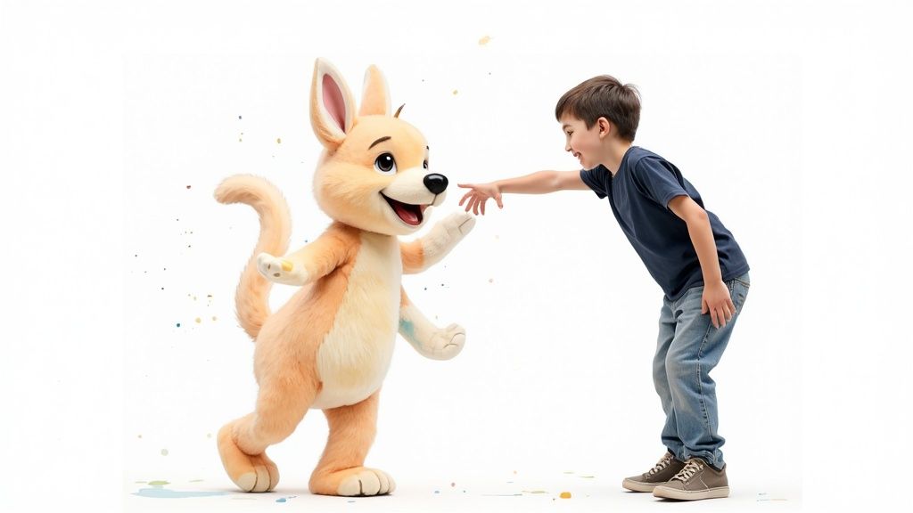
3. Illustrated Brand Character Header
Want to inject personality and charm into your newsletter headers? Consider using an illustrated brand character header. This engaging approach features custom illustrations, mascots, or brand characters designed to forge a stronger emotional connection with your readers. By humanizing your brand, this strategy makes newsletters feel more personal, approachable, and memorable. It transforms a potentially mundane header into a vibrant, engaging introduction to your content. This style isn't just about pretty pictures; it's about building a relationship with your audience and creating a distinct brand identity.

An illustrated brand character header typically involves a central figure – your mascot or character – integrated into the design. This character can interact with other elements within the header, contributing to a mini-narrative or reflecting the newsletter's theme. Think of it as setting the stage for the content to follow. This strategy works by tapping into the power of visual storytelling. Instead of simply stating your brand message, you're showing it, making it more impactful and easier to remember. This resonates particularly well with audiences who appreciate creativity and a more personal touch.
Successful examples of this strategy abound. Mailchimp's Freddie, a friendly chimp, has become synonymous with the brand, embodying its playful and helpful personality. DigitalOcean uses Sammy the Shark, a surprisingly approachable sea creature, to represent their cloud platform. Slack’s illustrated headers, often featuring diverse characters in collaborative settings, highlight the platform's focus on teamwork and communication. Duolingo, the language-learning app, leverages its owl character, Duo, across its email communications, creating a consistent and recognizable brand presence. These companies demonstrate how a well-designed character can become a powerful brand ambassador.
So, how can you effectively implement this strategy for your own newsletter? Start by developing a consistent character personality. This character should embody your brand values and resonate with your target audience. Consider creating seasonal variations of your character or incorporating contextual illustrations to keep the header fresh and engaging. Ensure the illustrations align with your brand values and overall aesthetic. A whimsical character might work for a lifestyle blog, but a more serious or abstract design might be better suited for a professional services firm. Finally, test your character's appeal with your target audience to ensure it resonates.
This approach, popularized by figures like Ben Chestnut (Mailchimp co-founder) and design teams at Duolingo and Slack, offers several key benefits. It drives high emotional engagement, fosters memorable brand differentiation, appeals to diverse audiences, and provides flexibility for seasonal campaigns. The shareable nature of visually appealing content also encourages social media engagement, further extending your reach.
However, it's important to consider the potential downsides. Creating and maintaining a brand character requires an investment in professional illustration and design, leading to higher production costs and time. This approach may not suit serious industries like finance or law, where a more formal tone is generally preferred. Maintaining consistency in character development is crucial; inconsistencies can dilute your brand message and confuse your audience. Finally, there's a risk of appearing unprofessional if the character is poorly designed or doesn't align with your brand.
The illustrated brand character header deserves its place in this list because it offers a powerful way to connect with your audience on a deeper level. While it requires more upfront investment than simpler header designs, the potential rewards in terms of brand recognition, engagement, and memorability make it a valuable strategy for newsletters looking to stand out in a crowded inbox. This approach is particularly effective for businesses targeting younger demographics or those operating in creative and lifestyle industries. By focusing on developing a compelling character that embodies your brand values, you can transform your newsletter header into a valuable asset that strengthens your brand identity and fosters lasting relationships with your readers. Remember to carefully consider your target audience and brand personality to ensure a cohesive and impactful design.
4. Hero Image with Overlay Text
One of the most impactful ways to grab your readers' attention and set the tone for your newsletter is by using a hero image with overlay text in your header. This design approach leverages the power of visuals to immediately draw the reader in and communicate a message, feeling, or theme before they even start reading the content. It's a popular technique employed by successful brands to elevate their email marketing and create a more engaging experience for their subscribers. This strategy works particularly well because it combines strong visuals with concise messaging, creating a compelling first impression. This makes it a valuable addition to any newsletter header ideas arsenal.

A hero image header utilizes a large, high-quality image—either a photograph or graphic—as the background of the header. Crucially, text and branding elements, like your logo or newsletter title, are overlaid on top of the image. This overlay text usually highlights the key message of the newsletter or the current campaign. For example, a travel newsletter might use a stunning image of a tropical beach with overlay text announcing a special offer on vacation packages. The image instantly sets the mood for relaxation and escape, while the text provides the call to action. This powerful combination of visuals and concise text can significantly boost engagement. Learn more about Hero Image with Overlay Text
Successful implementations of this technique can be seen in the travel newsletters from Airbnb, which often feature stunning destination photography, National Geographic's emails which showcase captivating images of wildlife and nature, and Patagonia's outdoor campaign emails that inspire adventure with breathtaking shots of mountains and landscapes. Food & Wine magazine also uses this tactic effectively to showcase delicious food photography. These brands expertly use hero images to tell a story, convey a feeling, and reinforce their brand identity.
To successfully implement a hero image header, consider these key features: high-resolution background images that avoid pixelation, overlay text with proper contrast against the background image, options for using gradients or color overlays to further enhance text readability, responsive image optimization to ensure the header looks good on all devices, and strategic text placement to avoid obscuring crucial elements of the image.
The benefits of this approach are numerous. The high visual impact leads to increased engagement and click-through rates. It's an excellent method for visual storytelling and can be adapted to various campaigns and seasons. The right image can create a strong emotional connection with the reader, particularly beneficial for lifestyle brands. However, this method comes with its own set of challenges. Larger image files can affect email loading times. Ensuring text readability on the image can be tricky. Some email clients may block images altogether. Finally, this strategy necessitates access to high-quality photography or graphic design resources.
Here are some actionable tips to ensure your hero image header is effective:
Always include alt text for images: This is crucial for accessibility and for readers whose email clients block images.
Test text contrast on various devices: Make sure your text is easily readable on different screen sizes and resolutions.
Use web-optimized image formats (like WebP): This helps reduce file size without compromising quality.
Provide fallback colors for blocked images: This ensures a cohesive look even if the image doesn't load.
Consider dark or light overlays for text legibility: A semi-transparent overlay can create a better contrast between the text and the image.
The popularity of the hero image with overlay text header can be attributed, in part, to the innovative work of the Airbnb design team, the National Geographic digital team, and various travel and lifestyle magazine publishers. They recognized the potential of strong visuals in email marketing and pioneered its use in creating engaging and memorable newsletter experiences. By following the tips and examples outlined here, you too can leverage this powerful design technique to elevate your newsletters and capture your audience's attention.
5. Modular Grid Layout Header
Looking for a newsletter header that's both visually appealing and highly organized? A modular grid layout header might be the perfect solution for you. This design approach utilizes grid systems, similar to those used in web design, to arrange various header elements into a structured, balanced layout. This method is an excellent way to maximize the information density of your newsletter header while maintaining a clean, professional appearance and offering a superior user experience. It’s a particularly strong choice for those seeking sophisticated newsletter header ideas that convey authority and professionalism.
Essentially, a modular grid divides your header into distinct sections or modules. These modules can house different types of content, such as your logo, navigation links, social media icons, a brief introductory text, or even preview snippets of the newsletter's content. Think of it like building with LEGOs: each brick (module) has its designated place, and together they form a cohesive structure (your header). This structured approach makes it easier for readers to quickly scan and find the information they need, enhancing their overall engagement with your newsletter.
One of the core strengths of a modular grid layout is its flexibility. The grid-based structure allows you to easily rearrange and resize modules to fit different content needs. For example, you might dedicate a larger module to showcase a compelling image in one newsletter, while prioritizing navigation links in another. This modular component system ensures your header remains adaptable and visually appealing regardless of the specific content you're featuring. Consistent spacing and alignment between these modules further contribute to a polished, professional look. Moreover, with responsive breakpoints, the grid adapts seamlessly to different screen sizes, ensuring a consistent user experience across desktop, tablet, and mobile devices.
Several successful newsletters leverage the power of modular grids. HubSpot's marketing newsletters, for instance, often employ this technique to present a variety of content previews and calls to action in a clear, organized manner. Buffer's social media digests use a grid to showcase curated content from various platforms. Similarly, Shopify’s merchant newsletters and LinkedIn’s professional updates utilize grid layouts for easy navigation and a clear information hierarchy. These examples illustrate how modular grid layout headers contribute to a professional, modern, and efficient communication style.
Are you considering implementing a modular grid layout for your newsletter header? Here are some actionable tips for success:
Use consistent grid proportions: Establish a set of proportions for your grid modules to maintain visual harmony and balance. This consistency contributes to a more professional and polished aesthetic.
Maintain adequate white space: Avoid overcrowding the header. Sufficient white space between modules improves readability and prevents a cluttered appearance, a common con if modular grids are overused.
Prioritize the most important information: Place the most crucial elements, such as your logo and primary call to action, in prominent positions within the grid. This ensures they capture the reader’s attention immediately.
Test grid collapse on mobile devices: Given the smaller screen size on mobile, ensure your grid collapses gracefully and maintains readability on these devices. This responsive design is crucial for a positive user experience.
The modular grid layout has a rich history, influenced by the Swiss Design movement’s emphasis on clean lines and functional layouts, as well as Google Material Design principles and the Bootstrap framework. These influences underscore its focus on structure, clarity, and adaptability. Learn more about Modular Grid Layout Header
This approach provides a highly organized information hierarchy, creating a scalable design system that's easy to maintain and update. It also allows for efficient use of space, packing valuable information into your header without sacrificing clarity. While a modular grid layout can be incredibly effective, it’s important to be mindful of its potential drawbacks. It can appear cluttered if overused or if the balance of elements isn't carefully considered. It might also be overly complex for very simple newsletters where a minimalist approach might be more suitable.
Overall, a modular grid layout header is an excellent newsletter header idea for those seeking a professional, organized, and scalable solution. Its flexibility, efficiency, and adaptability make it a powerful tool for enhancing the visual appeal and user experience of your newsletters. By understanding the principles of grid systems and implementing these tips, you can create a header that effectively communicates your brand and engages your audience. This approach is particularly suited for those with a significant amount of information to convey in their headers, such as established content entrepreneurs, digital marketing professionals, and news reporters looking for newsletter header ideas that enhance their communication strategy.
6. Interactive Animated Header
Want to inject some serious wow factor into your newsletter header? An interactive animated header is a surefire way to grab attention and leave a lasting impression. This dynamic approach leverages CSS animations, GIFs, or other interactive elements to create a visually engaging experience for your subscribers. It’s a powerful tool for conveying your brand’s personality, showcasing technical sophistication, and making your newsletters truly memorable, earning it a deserved spot in our top newsletter header ideas.
An interactive animated header goes beyond static images. Imagine a subtle shimmering effect on your logo, a call-to-action button that pulsates gently, or a short, looping animation that showcases your latest product. These dynamic elements create a sense of movement and interactivity that captivates readers and encourages them to explore further. This approach is particularly effective in a crowded inbox, where capturing attention is paramount.
Here’s how it works: Interactive elements are typically implemented using CSS3 animations and transitions. These allow for smooth, subtle movements and effects that enhance the visual appeal without being overwhelming. For more complex animations, animated GIFs or even short cinemagraphs can be used. Interactive hover effects can add another layer of engagement, revealing hidden content or changing the appearance of elements when the mouse cursor passes over them.
Successful implementations of interactive animated headers can be seen in the email marketing campaigns of industry giants. Google's product announcement emails often feature sleek animations that highlight new features. Spotify’s year-end Wrapped campaigns use animated elements to showcase personalized listening statistics. Nike’s interactive product launches often incorporate animations to highlight the design and functionality of new shoes. Adobe, a leader in creative software, frequently uses animated headers to preview the capabilities of their latest updates. These examples demonstrate the versatility and effectiveness of interactive animated headers across various industries.
However, this innovative approach isn’t without its challenges. Limited email client support remains a key consideration. Not all email clients render CSS animations or interactive elements consistently. This is why providing static fallback images is crucial. These static images will be displayed in email clients that don't support animation, ensuring that your message still gets across.
Accessibility is another important factor. Overly flashy or rapidly moving animations can be distracting or even triggering for some users. Adhering to accessibility guidelines, such as providing sufficient contrast and avoiding excessive flashing, is essential for ensuring inclusivity. Subtlety is key. The goal is to enhance the user experience, not detract from it.
Developing interactive animated headers requires a higher level of technical expertise compared to static images. Testing across multiple email platforms is essential to ensure consistent rendering and identify potential issues. Also, bear in mind that complex animations can impact performance, particularly on older devices. Using CSS animations over heavy GIFs whenever possible can help mitigate this.
Here are some actionable tips to create effective interactive animated headers for your newsletter:
Provide static fallbacks: Ensure your message is still conveyed effectively even if animations aren't supported.
Keep animations subtle and purposeful: Avoid excessive or distracting movement. Animations should enhance, not overwhelm, the message.
Test across multiple email platforms: Check for rendering consistency and identify potential issues. Litmus and Email on Acid are excellent tools for this.
Consider accessibility guidelines: Prioritize inclusivity and ensure your animations are accessible to all users. The Web Content Accessibility Guidelines (WCAG) offer valuable resources.
Use CSS animations over heavy GIFs: Optimize for performance and reduce load times.
Interactive animated headers are particularly well-suited for tech-savvy audiences, industries where innovation is valued, and campaigns that aim to generate excitement and engagement. While they require more effort to implement, the potential payoff in terms of attention and memorability makes them a valuable addition to your newsletter header ideas arsenal. Consider incorporating this dynamic approach into your next campaign and see the difference it can make. This cutting-edge technique, popularized by companies like Google and Adobe, can truly elevate your newsletter above the noise and reinforce your brand's commitment to modern design and user experience.
7. Personal Brand Photography Header
In the crowded digital landscape, forging genuine connections with your audience is paramount. One powerful way to achieve this in your newsletters is through the use of a Personal Brand Photography Header. This newsletter header idea centers around showcasing authentic photography of the people behind your brand – be it team members, founders, or even satisfied customers – to foster trust and build stronger relationships. It's a strategy that leverages the power of visual storytelling and authentic representation to humanize your brand and create a more personal connection with your subscribers. This approach is a valuable addition to any newsletter header ideas arsenal.
This header style works by putting a face to the name, literally. Instead of a generic logo or stock image, subscribers are greeted with real people, creating a sense of familiarity and approachability. The images chosen should reflect the brand's personality and values, offering a glimpse behind the curtain and allowing the audience to connect with the humans driving the brand forward. This technique is especially effective for building trust, as it demonstrates transparency and authenticity. When done right, a Personal Brand Photography Header transforms a simple email into a personal message from a trusted friend or colleague.
Several successful examples illustrate the power of this approach. ConvertKit, a popular email marketing platform, often features its founder, Nathan Barry, in their newsletters, creating a sense of connection with their user base. Gary Vaynerchuk, a prolific entrepreneur and marketing expert, consistently utilizes personal photography in his email communications, strengthening his personal brand and fostering a loyal following. Many local businesses, consultants, and coaches also effectively use this tactic, showcasing their teams or themselves in action, building a sense of community and trust with their local clientele. These examples demonstrate how a Personal Brand Photography Header can be incorporated across various industries and niches.
Here are some actionable tips for implementing a Personal Brand Photography Header in your newsletters:
Invest in professional photography: High-quality images are essential for creating a positive first impression. While smartphone cameras have improved dramatically, professional photography can elevate your brand image and ensure a consistent, polished look.
Maintain a consistent visual style: Whether you opt for black and white portraits, vibrant action shots, or candid behind-the-scenes glimpses, maintaining a consistent visual style across your newsletter headers helps create a cohesive brand identity.
Update photos regularly to stay current: Don't let your header photography become stale. Regularly update your images to reflect the current state of your team, your work, or your brand's evolution. This keeps your newsletters fresh and engaging.
Consider team member consent and comfort: If featuring team members, always obtain their consent and ensure they are comfortable with the chosen photographs. This fosters a positive work environment and respects individual privacy.
Balance personal and professional elements: While the goal is to humanize your brand, maintaining a balance between personal and professional elements is crucial. Ensure the photography aligns with your overall brand messaging and avoids being overly informal or unprofessional.
A Personal Brand Photography Header offers several key benefits:
Builds personal connection and trust: Seeing the faces behind the brand helps foster a sense of familiarity and trust among subscribers.
Humanizes brand identity: It moves beyond the corporate facade, showcasing the real people who contribute to the brand's success.
Increases authenticity: This approach reinforces genuine brand values and fosters transparency.
Effective for small businesses: It's a powerful way for small businesses to connect with their audience on a personal level.
Creates emotional resonance: Authentic photography can evoke emotions and create a stronger connection with the audience.
However, it's important to also consider the potential downsides:
Requires regular photo updates: Maintaining fresh content requires ongoing effort and investment in photography.
May not scale for large organizations: Featuring every individual in a large organization may not be feasible or effective.
Privacy considerations for team members: Respecting individual privacy is paramount when featuring team members in your marketing materials.
Dependent on photography quality: The success of this approach hinges on the quality of the photography. Poor quality images can detract from your brand image.
This newsletter header idea is particularly well-suited for aspiring newsletter creators, established content entrepreneurs, digital marketing professionals, niche market strategists, and small business owners looking to establish a strong personal brand. News reporters can also utilize this approach to connect with their audience and build credibility. The personal touch afforded by a Personal Brand Photography Header can significantly elevate your newsletter and foster deeper connections with your subscribers. Popularized by individuals like Gary Vaynerchuk, Pat Flynn (Smart Passive Income), and Marie Forleo, as well as advocated by small business marketing experts, this approach has proven to be an effective way to humanize brands and build trust in the digital age. Therefore, it deserves a prominent place among your considered newsletter header ideas.
8. Data Visualization Dashboard Header
In the competitive landscape of email marketing, grabbing your audience's attention and delivering value quickly is paramount. One innovative newsletter header idea that achieves both is the Data Visualization Dashboard Header. This approach integrates charts, graphs, metrics, or infographic elements directly into the header, providing a snapshot of key information, trends, or performance data right from the get-go. This method is particularly effective for newsletters focused on analytics, finance, business intelligence, and any niche where data plays a central role, making it a worthy addition to our list of top newsletter header ideas.
A Data Visualization Dashboard Header transforms your newsletter's opening from a simple greeting into a powerful communication tool. Instead of burying key insights within the body of the email, you present them upfront, catering to the fast-paced consumption habits of today's readers. Imagine receiving a financial newsletter that immediately highlights market trends with a mini-chart in the header, or a social media report that showcases engagement metrics at a glance. This immediate value proposition encourages readers to delve deeper into the content and reinforces the newsletter's authority.
Successful implementations of this header style can be seen in various contexts. Think of the concise performance summaries presented in Google Analytics digest emails, the visually appealing progress reports from Salesforce, or the dynamic market dashboards featured in financial newsletters. Even social media analytics reports often utilize miniature graphs within the header to quickly convey performance metrics. These examples demonstrate the versatility and effectiveness of data visualization in capturing attention and delivering immediate value.
Here are some actionable tips for creating impactful Data Visualization Dashboard Headers:
Keep Visualizations Simple and Clear: Avoid cluttered charts or complex graphs. Focus on conveying one or two key metrics clearly and concisely. Simplicity is key for quick comprehension.
Use Consistent Color Coding: Establish a color scheme and stick to it across all your visualizations. This creates visual consistency and helps readers quickly associate colors with specific data points.
Provide Context for All Metrics: Don't just display numbers; explain what they represent. A percentage increase is meaningless without knowing the baseline or timeframe.
Ensure Data Accuracy Before Sending: Double-check all your data points before including them in your header. Inaccurate information can damage your credibility.
Include Alt Text for Chart Images: Make sure your visualizations are accessible to everyone, including those using screen readers, by providing descriptive alt text for all chart images.
The Data Visualization Dashboard Header offers a compelling blend of benefits:
Pros:
Immediate Value Communication: Presents crucial information upfront, capturing attention and demonstrating value.
Appeals to Data-Driven Audiences: Resonates with readers who appreciate concise and visually appealing data presentations.
Efficient Information Delivery: Communicates key metrics quickly and effectively.
Professional and Authoritative: Projects a sense of expertise and credibility.
Encourages Engagement with Content: Entices readers to explore the newsletter further for more in-depth analysis.
Cons:
Complex Design and Development: Requires more sophisticated design and coding skills compared to simpler headers.
May Overwhelm Non-Technical Audiences: Highly complex visualizations might alienate readers unfamiliar with data interpretation.
Requires Accurate, Up-to-Date Data: Relies on a constant stream of reliable data to maintain relevance.
Accessibility Challenges for Data Visualization: Requires careful attention to accessibility guidelines to ensure inclusivity.
This innovative approach to newsletter headers was popularized by figures like Edward Tufte, a pioneer in data visualization, and design teams at organizations like Google Analytics, Tableau, and the Financial Times graphics department. Their work has demonstrated the power of visual data representation in communication.
When should you consider using a Data Visualization Dashboard Header? This approach is ideal for newsletters targeting data-driven audiences, particularly in fields like finance, analytics, business intelligence, and marketing. If your newsletter regularly reports on key performance indicators, market trends, or other quantifiable data, this header style can significantly enhance its impact and engagement. By embracing this method, you can transform your newsletter header from a static element into a dynamic and insightful introduction to your content, ensuring your key message gets seen and understood in today's information-saturated world. This makes the Data Visualization Dashboard Header a powerful tool for anyone seeking to create more engaging and impactful newsletters.
Header Style | Implementation Complexity 🔄 | Resource Requirements ⚡ | Expected Outcomes 📊 | Ideal Use Cases 💡 | Key Advantages ⭐ |
|---|---|---|---|---|---|
Minimalist Logo-Centric Header | Low - simple layouts and limited elements | Low - minimal assets, logo-focused | Clean, professional, fast-loading headers | Brands with strong recognition, mobile-first | Timeless design, high readability, fast load |
Magazine-Style Editorial Header | Medium - structured grids, consistent updates | Medium - typography, editorial content | Establishes credibility, premium content feel | B2B, professional newsletters, regular issues | Editorial authority, trusted format |
Illustrated Brand Character | High - custom illustrations and character dev | High - illustration design and development | Emotional engagement, memorable branding | Playful, creative, seasonal campaigns | Brand differentiation, social sharing |
Hero Image with Overlay Text | Medium - high-quality images, overlay handling | Medium to High - photography and image editing | High visual impact, storytelling, emotional tone | Lifestyle brands, campaigns with strong visuals | Strong mood setting, flexibility |
Modular Grid Layout Header | Medium to High - grid system, multiple modules | Medium - design system, content management | Organized, information-rich headers | Complex newsletters, multiple content types | Scalable, professional, efficient info layout |
Interactive Animated Header | High - animations, interactivity, fallbacks | High - development and testing across clients | High engagement, memorable user experience | Tech-savvy, innovative brands, product launches | Cutting-edge, attention-grabbing |
Personal Brand Photography | Medium - photography sourcing and styling | Medium - professional photography and updates | Builds trust, personal connection | Small businesses, personal brands, coaching | Authenticity, emotional resonance |
Data Visualization Dashboard | High - charts, real-time data integration | High - data accuracy, visualization tools | Communicates key metrics quickly | Analytics, finance, business intelligence | Professional, efficient data delivery |
From minimalist logos to interactive animations, we've explored eight diverse newsletter header ideas to inspire your creativity. Remember, your newsletter header is the first impression, a crucial element in grabbing your reader's attention and setting the tone for your content. Whether you're a small business owner, a digital marketing professional, or a seasoned content entrepreneur, choosing the right header can significantly impact your newsletter's success.
Key takeaways for creating compelling newsletter headers include aligning the design with your brand identity, considering your target audience's preferences, and ensuring the header complements the overall message of your newsletter. Don't be afraid to experiment with different styles like the minimalist logo approach, the magazine-style editorial header, or even a data visualization dashboard if it suits your niche. A/B testing different newsletter header ideas is vital to understanding what resonates best with your subscribers.
Mastering these concepts can transform your newsletter from a simple email update into a powerful engagement tool. An effective header draws readers in, encourages them to explore your content, and ultimately strengthens your brand presence. This, in turn, can lead to increased open rates, click-through rates, and ultimately, contribute to the growth and monetization of your newsletter.
Grow Newsie's resources, like the Newsletter Growth Blueprint, can provide further guidance and tools to optimize your entire newsletter strategy. Take the next step, implement these newsletter header ideas, and watch your email engagement soar. Your audience awaits!