- Grow Newsie
- Posts
- Top Newsletter Landing Pages to Boost Subscribers in 2025
Top Newsletter Landing Pages to Boost Subscribers in 2025
Discover 8 effective newsletter landing pages to grow your subscribers fast. Optimize your strategy for maximum results in 2025!
Nikhil Wad
May 24, 2025
Landing Page Gold: Crafting Newsletter Sign-Up Pages That Convert
Want to grow your email list? Your newsletter landing page is crucial for attracting subscribers. This article reveals eight effective newsletter landing page examples to boost your sign-up rate. Discover minimalist designs, content previews, social proof strategies, multi-step conversions, video integration, benefit-driven approaches, exclusive offers, and community-focused pages. Learn what makes each newsletter landing page type effective and how to implement these techniques for rapid subscriber growth.
The minimalist approach to newsletter landing pages prioritizes conversion through simplicity. It's all about removing distractions and focusing the visitor's attention on a single action: signing up. This design philosophy emphasizes clean lines, ample white space, concise copy, and a highly visible call-to-action (CTA). By reducing friction in the signup process, minimalist landing pages aim to maximize conversion rates. This approach works particularly well for newsletters with a broad appeal where the core value proposition can be communicated succinctly.
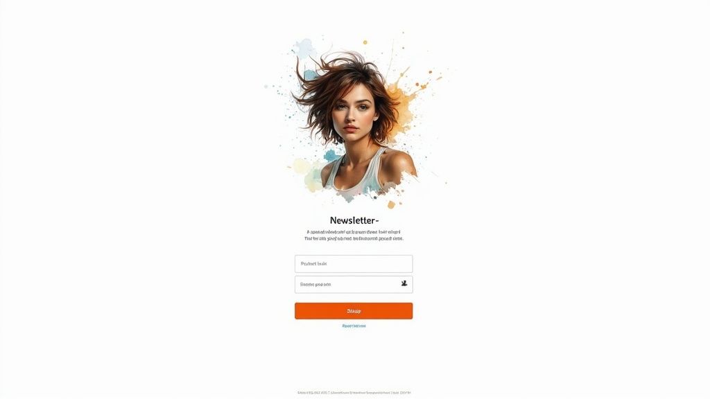
Successful implementations of this strategy can be seen in the signup pages of popular newsletters like Morning Brew, The Hustle, and Robinhood Snacks. These landing pages typically feature a single-field email capture form, minimal text focusing on a clear value proposition, and a high-contrast CTA button that immediately grabs the user's attention. This design facilitates quick page load times and seamless navigation across all devices. The clear focus on the primary action — signing up — minimizes confusion and encourages conversions. This design makes it one of the most effective newsletter landing pages.
Features of a Minimalist Newsletter Signup Page:
Single-field email capture form: Reduces friction by requiring minimal input from the visitor.
Minimal distractions with focused messaging: Keeps the visitor's attention on the value proposition and the signup form.
High contrast CTA buttons: Makes the signup button stand out and encourages clicks.
Mobile-responsive design: Ensures optimal viewing and functionality on all devices.
Clear value proposition statement: Communicates the benefit of subscribing in a concise and compelling manner.
Pros:
Higher conversion rates due to reduced friction: Simpler signup process leads to more subscriptions.
Faster page load times: Minimal design elements contribute to faster loading speeds.
Easy to implement and maintain: Simplicity makes these landing pages easy to set up and manage.
Works well across all devices: Responsive design ensures a positive user experience on desktops, tablets, and smartphones.
Clear focus on the primary action: Eliminates distractions and encourages signups.
Cons:
Limited space for persuasive content: May not be suitable for complex offerings requiring detailed explanations.
May not provide enough information for complex offerings: The concise nature may not allow for in-depth descriptions of the newsletter's content.
Can appear too generic without proper branding: Requires careful branding to avoid looking bland and unmemorable.
Limited opportunity to showcase social proof: Minimalist design often lacks space for testimonials or subscriber counts.
Tips for Creating a Minimalist Newsletter Landing Page:
Focus on a single, compelling value proposition: Clearly communicate the key benefit of subscribing.
Use A/B testing to optimize button color and copy: Experiment to find the most effective CTA.
Include a privacy statement to build trust: Assure visitors that their data will be handled responsibly.
Minimize form fields (ideally just email): Reduce the barrier to entry by asking for only essential information.
Consider using subtle animations to draw attention to the signup form: Subtle movements can guide the user's eye to the desired action.
Why Choose a Minimalist Approach?
This type of newsletter landing page excels in capturing leads quickly and efficiently. Its streamlined design is perfect for newsletters with a clear, concise value proposition that can be communicated effectively with minimal text. This makes it an ideal choice for aspiring newsletter creators, established content entrepreneurs, digital marketing professionals, niche market strategists, small business owners, and news reporters looking to grow their audience rapidly. The ease of implementation and maintenance also makes it a practical solution for those with limited technical resources. If your goal is to maximize conversions with a simple, effective design, the minimalist approach is a strong contender among other newsletter landing pages.
Thinking of starting a newsletter?
I’ve partnered with the beehiiv team to set you up with:
✅ 20% off your first 3 months
✅ A free 30-day trial, no credit card needed
It’s packed with features that make creating great content easier: AI tools that save time, landing pages that convert better, and a built-in ad network to help you earn more.

A Content Preview Newsletter Landing Page focuses on showcasing actual newsletter content to give potential subscribers a taste of what they'll receive. This approach builds trust and sets clear expectations by displaying past issues, content excerpts, or even screenshots directly on the landing page, allowing visitors to assess the value proposition before subscribing. This transparency helps attract more qualified subscribers who are genuinely interested in the content, ultimately leading to higher engagement and lower unsubscribe rates.
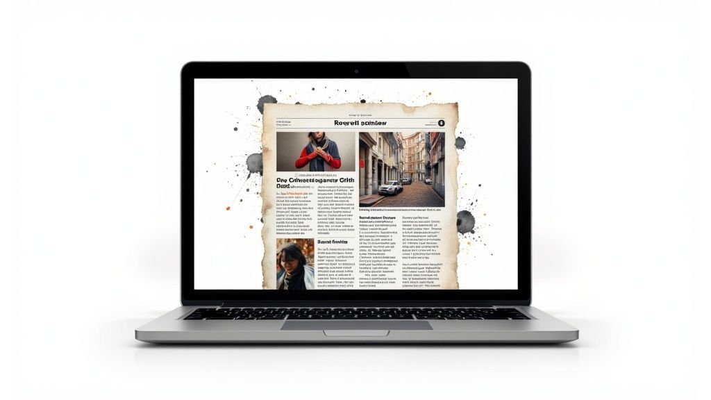
Successful implementations of this strategy can be seen with newsletters like The New York Times Cooking, Stratechery by Ben Thompson, Brain Pickings by Maria Popova, and Further by Darren Rowse. These newsletters effectively utilize content previews to entice potential subscribers. For instance, The New York Times Cookingnewsletter landing page features mouthwatering images and snippets of recipes, instantly conveying the value proposition to food enthusiasts. Similarly, Stratechery showcases excerpts of Ben Thompson's insightful analysis on the intersection of business, strategy, and technology.
This type of newsletter landing page is particularly effective for newsletters with high-quality content that speaks for itself. By showcasing the content upfront, you're pre-qualifying your subscribers, ensuring they are genuinely interested in what you offer. This leads to a more engaged audience and reduces the likelihood of unsubscribes down the line. Learn more about Content Preview Newsletter Landing Page for a deeper dive into content strategy for newsletters.
Features to consider:
Embedded newsletter samples or screenshots: Displaying actual content within the landing page provides a tangible representation of the newsletter's value.
Content categorization or issue archive: Organize past content by topic or date for easy browsing.
Preview functionality: Allow visitors to "preview" a sample issue or specific content sections.
Testimonials from current subscribers: Leverage social proof to build credibility and demonstrate the value of your newsletter.
Clear publication schedule information: Set expectations upfront about how frequently subscribers will receive your newsletter.
Pros:
Sets clear expectations for new subscribers: Reduces ambiguity and ensures subscribers know what they're signing up for.
Builds credibility through content transparency: Demonstrates the quality and value of the newsletter content.
Helps attract more qualified subscribers: Pre-qualifies subscribers based on their interest in the showcased content.
Reduces unsubscribe rates by pre-qualifying interest: Subscribers are less likely to unsubscribe if they know what to expect.
Provides multiple conversion opportunities: Offering various content samples can appeal to different segments of your target audience.
Cons:
Requires more maintenance to keep samples current: Regularly updating the displayed content can be time-consuming.
Can make the page longer and more complex: Showcasing multiple content samples can increase the length and complexity of the landing page.
May overwhelm visitors with too much information: Presenting too much content can be overwhelming and deter potential subscribers.
Higher development cost and complexity: Implementing dynamic content previews may require more advanced development resources.
Tips for optimizing your Content Preview Newsletter Landing Page:
Regularly update content samples to keep them fresh: Ensure the displayed content is relevant and up-to-date.
Include a table of contents from recent issues: Provide a quick overview of the topics covered in past newsletters.
Add a "most popular" section to highlight best content: Showcase your most engaging content to attract potential subscribers.
Use analytics to identify which previews convert best: Track which content samples generate the most subscriptions and optimize accordingly.
Consider offering a "sample issue" download option: Provide a downloadable PDF version of a past issue for offline reading.
This approach, popularized by Substack creators, The Skimm, Ben Thompson (Stratechery), and Maria Popova (Brain Pickings), is highly effective for building a loyal subscriber base by focusing on content quality and transparency. It caters to aspiring newsletter creators, established content entrepreneurs, digital marketing professionals, niche market strategists, small business owners, and news reporters looking to establish a strong connection with their audience.
This type of newsletter landing page prioritizes building trust and credibility by showcasing what others say about your newsletter. It leverages the psychology of social proof – the idea that people are more likely to do something if they see others doing it and approving of it. Instead of relying solely on your own claims about the newsletter's value, a social proof-centric page emphasizes testimonials, subscriber counts, media mentions, and other forms of validation from third parties. This approach is particularly effective for new or growing newsletters looking to establish authority and quickly gain the trust of potential subscribers.

Successful implementations of this strategy often include features like prominent subscriber count displays, curated testimonials from satisfied readers, logos of media outlets that have featured the newsletter, social media integrations showcasing engagement metrics, and even highlighted quotes from recognizable subscribers. This strategy makes your newsletter landing page less about you and more about the value your subscribers receive, as demonstrated by their own words and actions.
Examples of successful social proof-centric newsletter landing pages include:
Tim Ferriss' 5-Bullet Friday: Ferriss often highlights the impressive number of subscribers and frequently features reader feedback within the newsletter itself, further reinforcing the social proof.
James Clear's 3-2-1 Newsletter: Clear's landing page emphasizes the immense popularity of his newsletter, showcasing the substantial subscriber count.
Trends by The Hustle: This newsletter landing page leverages testimonials and subscriber numbers effectively.
Not Boring by Packy McCormick: McCormick's landing page highlights community aspects and social engagement around the newsletter.
Tips for creating an effective social proof-centric newsletter landing page:
Automate subscriber count updates: Ensure your displayed subscriber count remains accurate and up-to-date.
Feature relatable testimonials: Showcase testimonials from a diverse range of readers, not just celebrities or influencers. Focus on testimonials that highlight specific benefits your readers have experienced.
Highlight specific benefits: Instead of generic praise, select testimonials that mention specific improvements or valuable insights readers gained from the newsletter.
Include industry recognition: Display any awards, badges, or recognition your newsletter has received.
Create an "As Featured In" section: If your newsletter has been mentioned in the press, create a dedicated section showcasing media logos.
Pros of a social proof-centric approach:
Builds immediate credibility and trust: Seeing positive feedback from others instantly reassures potential subscribers.
Leverages the psychology of social proof: Taps into the inherent human tendency to follow the crowd.
Particularly effective for new or growing newsletters: Helps establish authority and overcome initial skepticism.
Addresses skepticism through third-party validation: Provides objective evidence of the newsletter's value.
Can justify premium or paid newsletter offerings: Social proof can help convince potential subscribers that the content is worth paying for.
Cons of a social proof-centric approach:
Requires existing subscribers or testimonials: Difficult to implement if you're just starting out.
Can appear boastful if not carefully balanced: Avoid excessive self-promotion and focus on genuine reader feedback.
May overshadow actual content value proposition: Ensure the focus remains on the value your newsletter provides, not just its popularity.
Needs regular updating as metrics change: Keep testimonials fresh and subscriber counts accurate to maintain credibility.
This approach deserves a place on this list because it offers a powerful way to build trust and encourage sign-ups, especially for newer newsletters struggling to gain traction. By leveraging the power of social proof, you can create a compelling landing page that converts visitors into loyal subscribers. This is a crucial strategy for aspiring newsletter creators, established content entrepreneurs, digital marketing professionals, niche market strategists, small business owners, and even news reporters looking to grow their audience.
A multi-step conversion newsletter landing page breaks the signup process into smaller, more digestible steps instead of overwhelming visitors with a single, long form. This approach leverages the psychological principles of commitment and consistency. By securing small commitments initially, you increase the likelihood of visitors completing the final step: providing their email address. This method can be a powerful tool for building highly engaged newsletter audiences and is becoming increasingly popular for effective newsletter landing pages.
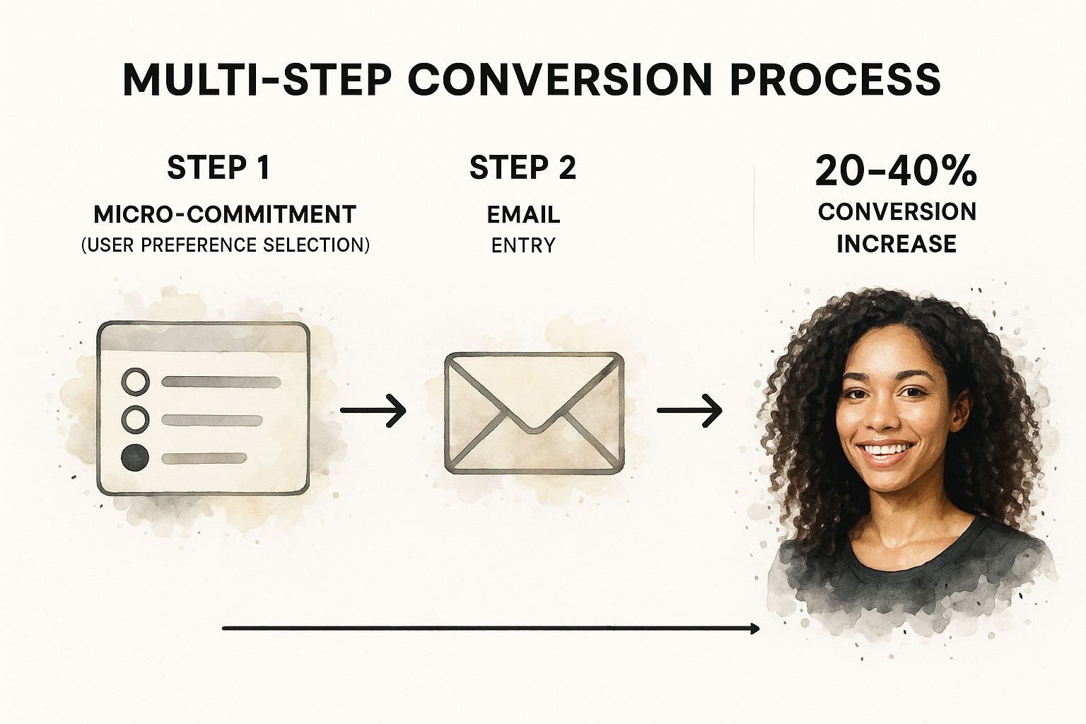
The infographic above visualizes a typical flow for a multi-step newsletter signup process. It demonstrates how micro-commitments, like selecting preferences or answering a question, lead a user through the process, ultimately ending in the email capture. This staged approach reduces the perceived barrier to entry and makes the overall signup experience less intimidating. The visualization highlights the importance of starting with broader questions and progressively narrowing down to specific preferences, culminating in the email opt-in.
This type of newsletter landing page often incorporates interactive elements like quizzes, preference selectors, and personalized questions based on previous answers. Features like progress indicators ensure users know where they are in the process, further encouraging completion. This allows you to gather valuable data about your subscribers, enabling better segmentation and personalized content delivery down the line. For instance, you might ask about industry, job role, or specific interests, tailoring the subsequent newsletter content to these preferences.
Examples of successful multi-step newsletter landing pages include theSkimm's personalized onboarding, Morning Brew's referral program landing pages, Finimize's investment preference flow, and The Hustle's subscriber categorization. These companies have demonstrated how this strategy can significantly boost subscriber engagement and growth.
Pros:
Higher engagement through interactive elements
Improved conversion rates through commitment psychology
Collects additional subscriber data for segmentation
Creates a personalized experience for subscribers
Reduces form abandonment through a staged approach
Cons:
More complex to implement technically
Can increase friction if too many steps are added
Requires more testing and optimization
Higher development and maintenance costs
May deter users who prefer simplicity
Tips for Implementation:
Limit the steps: Keep it concise with a maximum of 2-3 steps to prevent user drop-off.
Show clear progress: Visual progress indicators reassure users and encourage completion.
Test and optimize: Experiment with different question sequences to find the optimal flow for your audience.
Provide value at each step: Ensure each interaction is meaningful and benefits the user.
Offer a skip option: Allow users to bypass steps if they prefer a quicker signup.
This approach is particularly beneficial for newsletters targeting niche audiences or offering highly specialized content. By gathering specific information upfront, you can tailor the newsletter experience and provide more relevant information, leading to higher engagement and retention. Learn more about Multi-Step Conversion Newsletter Landing Page. This strategy deserves a place on this list because it represents a powerful shift from passive signup forms to engaging, interactive experiences that benefit both the subscriber and the newsletter creator. It's a valuable technique for anyone looking to optimize their newsletter landing pages and grow a highly engaged subscriber base.
A Video-Enhanced Newsletter Landing Page uses video as its central element to showcase the newsletter's value and connect with potential subscribers. Instead of relying solely on text, this type of landing page leverages the power of video to communicate more effectively and build a stronger relationship with the audience. This approach deserves a place on this list because it offers a dynamic and engaging way to convert visitors into subscribers, ultimately boosting your newsletter's growth. It's particularly impactful in today's visually-driven digital landscape.
How it Works:
The core of this landing page is an introductory video, often featuring the newsletter creator themselves. This video explains what the newsletter is about, what subscribers can expect (e.g., frequency, topics covered, exclusive content), and often provides a glimpse into the newsletter's format and style. The video aims to build trust and excitement around the newsletter, making it more appealing to sign up.
Features:
Prominently Featured Introductory Video: The video takes center stage on the landing page.
Autoplay (Muted) Option: Often, the video will autoplay (muted) as soon as the page loads, instantly grabbing the visitor's attention.
Transcript or Key Points: A transcript or a list of key takeaways alongside the video caters to those who prefer reading or can't listen to audio.
Creator Personality Showcase: The video allows the creator to inject their personality and build a personal connection with the audience.
Behind-the-Scenes or Creation Process Insights: Some videos offer a sneak peek into the newsletter creation process, adding a layer of authenticity and transparency.
Pros:
Creates Stronger Personal Connection: Seeing and hearing the creator fosters a stronger bond with the audience than text alone.
Communicates More Information in Less Time: Video can convey complex ideas quickly and efficiently.
Increases Time on Page and Engagement: Engaging video content keeps visitors on the page longer, increasing their likelihood of subscribing.
More Effective Explanation of Complex Newsletter Concepts: Visual demonstrations and explanations simplify complex topics.
Builds Trust through Face-to-Face Connection: The video creates a sense of personal interaction, fostering trust and credibility.
Cons:
Increases Page Load Time: Videos can increase page load time, potentially leading to visitor drop-off.
Requires Video Production Skills or Resources: Creating high-quality videos requires some level of video production expertise and equipment.
May Not Be Consumed by All Visitors: Some visitors may not have the time or bandwidth to watch a video.
Requires Maintenance When Content Needs Updating: Keeping the video content up-to-date requires ongoing effort.
Accessibility Concerns if Not Implemented Properly: Videos need captions and transcripts to be accessible to all users.
Examples:
While direct links to specific landing pages can be difficult to find due to evolving marketing strategies, creators like Amy Porterfield (digital marketing), Pat Flynn (online business), Peter McKinnon (photography), and Marie Forleo (business and personal development) have popularized this method. Observing their general website and marketing materials can offer insights into their use of video in promoting their newsletters.
Tips for Implementation:
Keep Videos Under 90 Seconds: Shorter videos tend to hold viewers' attention more effectively.
Include Captions for Accessibility and Sound-Off Viewing: Captions are essential for accessibility and for viewers who prefer watching videos without sound.
Place Signup Form Directly Below or Beside the Video: Make it easy for viewers to subscribe immediately after watching the video.
Test Autoplay vs. Click-to-Play for Your Audience: A/B test to determine which approach works best for your target audience.
Create a Compelling Thumbnail That Encourages Plays: A visually appealing thumbnail will entice visitors to click and watch the video.
When to Use This Approach:
This strategy is particularly effective for newsletters with a strong personal brand or where the creator is a central figure. It's also beneficial for newsletters covering complex topics that can be better explained through visual demonstration. If you're comfortable being on camera and have the resources to produce high-quality videos, a video-enhanced landing page can significantly elevate your newsletter signup rates. This approach can be particularly beneficial for aspiring newsletter creators, established content entrepreneurs, digital marketing professionals, niche market strategists, and small business owners looking to create a personal connection with their audience. News reporters might also find value in demonstrating their credibility and building relationships with potential readers through this video based signup process.
A Benefits-Focused Newsletter Landing Page prioritizes the tangible advantages subscribers gain by signing up, directly answering the crucial question: "What's in it for me?" Instead of simply describing the newsletter's content, this type of landing page highlights how that content translates into real-world benefits for the reader. This approach makes it a powerful tool for attracting and converting visitors into loyal subscribers. It's particularly effective for newsletter landing pages because it immediately grabs attention and demonstrates value, two key factors in a visitor's decision to subscribe.
This method works by structuring the landing page around specific benefits that resonate with the target audience's pain points and desires. Think of it as a problem-solution framework, where the problem is what the audience struggles with, and the solution is what your newsletter provides. This is distinctly different from simply listing features. For example, instead of saying "Weekly email newsletter with marketing tips," a benefits-focused approach would say, "Get proven marketing strategies delivered weekly to boost your website traffic and generate more leads."
Features of a Benefits-Focused Landing Page:
Benefit-driven headlines and copy: Every word should focus on the subscriber's gain.
Before/after scenarios or transformations: Illustrate the positive change your newsletter can bring.
Bulleted value propositions: Concisely highlight key benefits.
Problem-solution framing: Clearly define the problem and position the newsletter as the solution.
ROI-focused messaging: Emphasize tangible returns like time saved, knowledge gained, or income increased.
Pros:
Directly addresses subscriber motivation.
Clearly communicates value proposition.
Appeals to practical, results-oriented audiences.
Easier to measure against delivered value.
Focuses on outcomes rather than features.
Cons:
Can come across as overly promotional if not authentic.
Requires deep understanding of audience pain points.
Benefits need to be realistic and deliverable.
May require more copywriting expertise.
Needs regular updating as benefits evolve.
Examples of Successful Implementation:
Ramit Sethi's I Will Teach You To Be Rich: Focuses on helping subscribers achieve financial freedom.
Moz's SEO newsletter landing page: Emphasizes improving search engine rankings and driving more organic traffic.
Neville Medhora's Kopywriting Kourse: Highlights how subscribers can improve their copywriting skills to increase sales and conversions.
Backlinko by Brian Dean: Promises actionable SEO strategies to grow website traffic.
Actionable Tips for Creating a Benefits-Focused Newsletter Landing Page:
Frame benefits in terms of time saved, money earned, or problems solved.
Use specific numbers when possible (e.g., "5 actionable tips every week").
Include mini case studies showing real results.
Focus on both immediate and long-term benefits.
Test different benefit hierarchies to see which resonates most.
When and Why to Use This Approach:
This approach is particularly effective when your target audience is pragmatic and results-oriented. If your subscribers are primarily interested in practical advice and tangible outcomes, a benefits-focused landing page will resonate strongly. This is often the case with newsletters focused on business, marketing, finance, and self-improvement. Learn more about Benefits-Focused Newsletter Landing Page can provide additional insights.
Why It Deserves a Place on the List:
In the crowded world of online content, a Benefits-Focused Newsletter Landing Page stands out by directly addressing the needs and desires of the target audience. By clearly articulating the value proposition and showcasing tangible benefits, this approach maximizes conversion rates and builds a loyal subscriber base. This makes it an essential strategy for anyone looking to create a successful newsletter. Optimizing your newsletter landing pages for keywords like "newsletter landing pages" can also significantly improve their visibility and attract more subscribers.
This type of newsletter landing page caters specifically to premium or paid newsletters. It focuses on highlighting exclusivity, special access, and the high value of the content offered. By creating a sense of belonging to an elite group and clearly demonstrating the value proposition, this landing page justifies the subscription cost and attracts a committed audience willing to invest in quality content. This approach is a significant departure from free newsletter landing pages and requires a different strategy altogether, earning its place on this list as a powerful way to monetize valuable insights and build a dedicated community.
How it Works:
An exclusive/premium newsletter landing page works by showcasing the unique benefits subscribers receive by paying for access. It goes beyond simply listing topics covered; it emphasizes the transformation subscribers can expect, the exclusive community they join, and the return on investment (ROI) they can achieve. This is achieved through persuasive copy, compelling testimonials, and a clear breakdown of the exclusive content offered. Instead of focusing on broad reach, the goal is to attract highly engaged subscribers who value the premium experience.
Features of a Successful Premium Newsletter Landing Page:
Premium Visual Design Elements: The design needs to reflect the high-quality content being offered. Think clean, modern aesthetics, high-quality images, and professional typography.
Clear Pricing and Value Comparison: Transparent pricing is key. Showcasing the value relative to the cost, perhaps compared to similar offerings or the cost of alternative learning resources, strengthens the justification for the price.
Member Testimonials Focusing on ROI: Social proof is crucial. Testimonials from satisfied subscribers, specifically highlighting the value they've received (e.g., career advancement, improved business decisions), significantly boost credibility.
Limited-Time Offers or Founding Member Benefits: Creating a sense of urgency or exclusivity can encourage immediate sign-ups. This might involve limited-time discounts, bonus content for early subscribers, or access to a founding member community.
Detailed Breakdown of Exclusive Content: Clearly outline what subscribers get that free readers don't. This might include in-depth reports, access to exclusive webinars or Q&A sessions, or a private community forum.
Examples of Successful Implementation:
Scott Galloway's No Mercy/No Malice (premium tier): Galloway effectively uses a multi-tiered approach, offering both free and paid content. The premium tier landing page emphasizes exclusive content, community access, and early access to his popular podcasts.
Ben Thompson's Stratechery: A prime example of a successful premium newsletter, Stratechery's landing page clearly articulates the value proposition, highlighting the in-depth analysis and unique perspectives offered to subscribers.
The Information: This publication focuses on providing exclusive news and insights about the tech industry, justifying its premium price point with high-quality journalism and access to a network of experts.
The Browser by Robert Cottrell: This curated newsletter provides hand-picked articles with insightful commentary, offering a premium experience for discerning readers.
Pros:
Effectively positions higher-priced newsletter offerings.
Attracts more committed, higher-quality subscribers.
Creates a perception of premium value.
Can generate direct revenue through paid subscriptions.
Often results in higher engagement rates.
Cons:
Smaller potential audience due to price barrier.
Higher expectations for content quality and delivery.
Requires stronger proof elements to justify cost.
More complex to set up payment processing.
Needs regular premium content to retain subscribers.
Actionable Tips:
Clearly differentiate free vs. paid content value: Make it crystal clear what subscribers get for their money and why it's worth the investment.
Offer a free trial or sample premium content: Allow potential subscribers to experience the value firsthand before committing.
Include a money-back guarantee to reduce risk: This builds trust and encourages sign-ups.
Show transparent pricing with comparison to alternatives: Justify the cost by comparing it to similar offerings or the cost of obtaining the same information elsewhere.
Consider annual payment options with a discount: This incentivizes long-term subscriptions and provides a more predictable revenue stream.
When and Why to Use This Approach:
This approach is ideal when you have highly valuable, niche content that caters to a specific audience willing to pay for exclusive access and insights. If you're offering unique analysis, in-depth research, or access to a specialized community, a premium newsletter landing page can be a highly effective way to monetize your expertise and build a loyal following. It's particularly effective for established content creators, industry experts, and thought leaders looking to build a dedicated community around their work and generate recurring revenue.
A Community-Focused Newsletter Landing Page goes beyond simply delivering content; it positions your newsletter as the gateway to a thriving community of like-minded individuals. This approach emphasizes connection, collaboration, and shared interests, creating a much more engaging experience for subscribers. Instead of just receiving emails, subscribers become part of a network where they can interact with each other, share ideas, and build relationships. This type of newsletter landing page is an excellent choice for those seeking to cultivate a loyal audience and foster a sense of belonging. This deserves a spot on this list of newsletter landing pages because it offers a powerful way to differentiate yourself from the competition and build a truly engaged audience. It's not just about consuming content; it's about being part of something bigger.
How it Works:
This strategy centers around creating a landing page that highlights the community aspects of your newsletter. It showcases the value proposition of joining not just for the content itself, but for the opportunity to connect with fellow subscribers. This is achieved by featuring elements that encourage interaction and showcase the existing community.
Features:
Community Metrics and Member Highlights: Showcasing the size and activity of your community (e.g., number of members, discussions) and highlighting active members or their achievements builds social proof and encourages participation.
Discussion Opportunities and Engagement Options: Include links to forums, comment sections, social media groups, or other platforms where subscribers can connect and interact.
Member Profiles or Spotlights: Featuring profiles or interviews with members allows subscribers to put faces to names and learn more about each other, strengthening the sense of community.
Event Announcements or Recordings: Promote online or offline events related to your newsletter's topic. This provides additional opportunities for subscribers to connect and learn.
Interactive Elements: Incorporate polls, quizzes, or community challenges to foster engagement and create a sense of fun and shared experience.
Pros:
Creates Stronger Belonging and Loyalty: Subscribers feel more connected to a community than just a newsletter, leading to higher engagement and retention rates.
Differentiates from Content-Only Newsletters: In a crowded inbox, offering a community sets you apart and provides a unique value proposition.
Provides Multiple Value Streams (Content + Community): Subscribers receive valuable content and access to a supportive network.
Higher Retention Rates through Relationship Building: When subscribers form connections with each other, they are more likely to stay subscribed.
Opens Additional Monetization Opportunities: A thriving community can open doors for partnerships, sponsorships, or premium membership offerings.
Cons:
Requires Ongoing Community Management: Building and maintaining a community requires dedicated effort and resources.
Sets Expectations for Interaction Beyond Content Delivery: You must be prepared to facilitate and moderate community interactions.
More Complex to Maintain and Scale: As your community grows, so will the challenges of managing it effectively.
Potential for Community Issues or Moderation Needs: Be prepared to address conflicts or inappropriate behavior within the community.
Success Depends on Reaching Critical Member Mass: A small, inactive community can be a deterrent rather than a draw for new subscribers.
Examples:
Indie Hackers: https://www.indiehackers.com/ (Courtland Allen) seamlessly integrates its newsletter with a thriving online community of entrepreneurs.
Product Hunt: Product Hunt's newsletter serves as a gateway to their platform, where users discover and discuss new products. (Ryan Hoover)
Women in Tech by Arlan Hamilton: This newsletter focuses on supporting women in the tech industry and fosters a strong sense of community.
Dave Gerhardt's DGMG community newsletter: Dave Gerhardt has built a strong community around his marketing insights and provides exclusive content and networking opportunities to his subscribers.
Tips for Creating a Community-Focused Newsletter Landing Page:
Showcase Community Wins and Member Successes: Highlight positive stories and achievements within the community to inspire and motivate new subscribers.
Include Clear Expectations about Community Engagement: Explain what kind of interactions subscribers can expect and how they can participate.
Feature User-Generated Content from Community Members: Showcasing content created by members strengthens the sense of community and encourages participation.
Consider Adding Community Platform Links (Slack, Discord, etc.): Provide direct links to your community platforms to make it easy for subscribers to join and connect.
Highlight Networking and Connection Opportunities: Emphasize the benefits of connecting with other like-minded individuals.
This type of newsletter landing page caters perfectly to aspiring newsletter creators, established content entrepreneurs, digital marketing professionals, niche market strategists, and small business owners looking to build a strong and engaged audience. Even news reporters could leverage this approach to create a more interactive experience for their readers. By focusing on community, you can create a newsletter that is not just informative but also a valuable source of connection and support for your subscribers.
Strategy | Implementation Complexity 🔄 | Resource Requirements ⚡ | Expected Outcomes 📊 | Ideal Use Cases 💡 | Key Advantages ⭐ |
|---|---|---|---|---|---|
Minimalist Newsletter Signup Page | Low | Low (simple form, design) | Higher conversion due to simplicity and speed | Simple offerings, broad audiences | Reduced friction, fast load, device-friendly |
Content Preview Newsletter Landing Page | Medium | Medium (content updates needed) | Builds trust and sets clear expectations | Newsletters needing transparency & content sampling | Content transparency, qualified subscribers |
Social Proof-Centric Newsletter Landing Page | Medium | Medium (testimonial curation) | Immediate credibility and trust | New/growing newsletters, premium offerings | Leverages social proof, builds trust quickly |
Multi-Step Conversion Newsletter Landing Page | High | High (complex forms, personalization) | Often 20-40% higher conversion rates | Personalized onboarding, segmented audiences | Interactive, personalized, reduces abandonment |
Video-Enhanced Newsletter Landing Page | Medium | High (video production) | Strong personal connection, higher engagement | Complex concepts, personality-driven newsletters | Builds trust, communicates more info quickly |
Benefits-Focused Newsletter Landing Page | Medium | Medium (targeted copywriting) | Clearly communicates value and subscriber motivation | Result-oriented, outcome-driven marketing | Addresses motivations, measurable value |
Exclusive/Premium Newsletter Landing Page | High | High (premium design, payment setup) | Attracts committed subscribers, generates revenue | Paid newsletters, high-value offerings | Positions premium value, supports monetization |
Community-Focused Newsletter Landing Page | High | High (community management) | Strong loyalty and retention | Newsletters with community/network focus | Builds belonging, multiple value streams |
Creating compelling newsletter landing pages is essential for converting casual visitors into dedicated subscribers. We've explored eight different approaches, from minimalist signup pages to community-focused landing pages, each offering unique advantages for different newsletter types and target audiences. The key takeaway is this: there's no one-size-fits-all solution. The most effective newsletter landing pages are tailored to resonate with your specific audience and clearly communicate the value your newsletter provides.
Remember the most impactful elements for success: a clear call to action, compelling copy that highlights the benefits of subscribing, and a user-friendly design. Building a high-converting newsletter landing page requires careful design and consideration of user experience. For a comprehensive guide on form best practices, check out this resource on creating effective web forms. Whether you’re showcasing social proof, offering premium content, or building a sense of community, optimizing your newsletter landing pages is paramount.
Mastering these strategies is more than just a checkbox on your to-do list. It's an investment in the future of your newsletter and your business. A highly optimized landing page translates directly into a larger subscriber base, stronger engagement, and ultimately, greater impact. By thoughtfully crafting your newsletter landing pages and implementing the strategies discussed, you can transform your newsletter from a simple communication tool into a powerful engine for growth. Now, go forth and create newsletter landing pages that not only convert but also captivate!