
Unlocking the Power of Dedicated Newsletter Landing Pages
Want more newsletter subscribers? A dedicated newsletter landing page is key to converting visitors. This listicle reveals eight effective newsletter landing page formats, each designed to boost your subscriber count. Learn how minimalist, social proof, lead magnet, video-first, multi-step, content preview, problem-solution, and community-focused newsletter landing pages can each uniquely attract your target audience. Discover the ideal format to grow your newsletter and expand your reach.
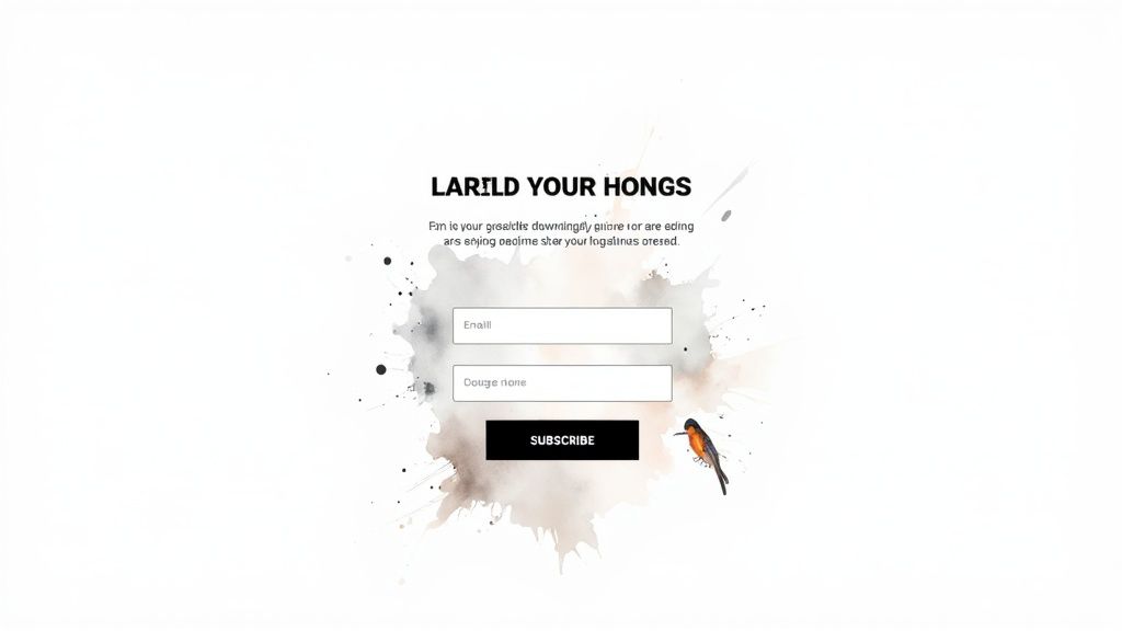
1. Minimalist Single-Focus Landing Page
For newsletter landing pages, the minimalist single-focus approach reigns supreme when it comes to converting visitors into subscribers. This strategy prioritizes a clean, distraction-free environment with a single call-to-action: signing up for the newsletter. By eliminating extraneous elements like navigation menus, sidebars, and excessive text, this type of landing page directs the visitor's attention solely towards the subscription form. This laser focus maximizes the chances of conversion by streamlining the user journey and removing potential distractions. The design typically features a compelling headline, a brief value proposition outlining the newsletter's benefits, an email input field, and a prominent subscribe button.
This approach deserves its place on this list due to its effectiveness and simplicity. It recognizes that the primary goal of a newsletter landing page is to gather subscribers, and it eliminates any element that might detract from that goal. For aspiring newsletter creators, established content entrepreneurs, digital marketing professionals, niche market strategists, small business owners, and even news reporters looking to build an audience, this strategy offers a powerful tool for growth.
The core features of a minimalist single-focus landing page contribute directly to its high conversion potential. The single call-to-action, with no competing links or navigation options, creates a clear and direct path for the user. The clean, white space-heavy design provides visual breathing room and emphasizes the essential elements. Minimal text and visuals reduce cognitive load, making the decision to subscribe easier. Mobile-first responsive design ensures optimal viewing and functionality across all devices, catering to the growing number of mobile users. Learn more about Minimalist Single-Focus Landing Page for design inspiration and further insights.
Several successful examples demonstrate the power of this approach. The Morning Brew's original landing page is a classic example of minimalist design, focusing solely on email capture. Austin Kleon's newsletter signup and Seth Godin's blog subscription page also employ this strategy effectively, prioritizing conversion over elaborate design. These examples showcase how simplicity can lead to substantial subscriber growth.
While the minimalist approach offers significant advantages, it’s important to acknowledge its potential drawbacks. The limited information provided on the landing page might not fully convey the brand's identity or establish sufficient trust. Some users may perceive the minimalist design as unprofessional or lacking depth. The absence of secondary conversion goals limits the potential for other actions, such as social media follows or product purchases. Building trust without testimonials or social proof can also be a challenge.
However, the pros often outweigh the cons. The minimalist approach typically boasts the highest conversion rates among newsletter landing pages due to its lack of distractions. Fast loading times contribute to a positive user experience and improve search engine optimization. The simplified design makes it easy to A/B test individual elements, such as headline copy or button color, to optimize for conversions. Furthermore, these landing pages are cost-effective to design and maintain due to their inherent simplicity.
To effectively implement a minimalist single-focus newsletter landing page, consider these actionable tips: Use compelling, benefit-focused headlines that clearly communicate the value proposition of the newsletter. Include a concise privacy statement near the signup form to reassure visitors about their data security. Test different button colors and copy to identify the most effective combination. Keep form fields to email only initially to reduce friction and increase signup rates. Use contrasting colors for the CTA button to make it visually prominent and encourage clicks. By following these tips, you can optimize your newsletter landing page for maximum conversions and build a thriving subscriber base.
This approach is particularly effective when launching a new newsletter or when the primary goal is rapid subscriber acquisition. It's ideal for businesses and individuals who prioritize conversion rates and appreciate the efficiency of a streamlined user experience. When clarity and conversion are paramount, the minimalist single-focus landing page provides a powerful and effective solution for building a successful email list. It's a testament to the principle that less is often more, particularly in the context of newsletter landing pages.
Thinking of starting a newsletter?
I’ve partnered with the beehiiv team to set you up with:
✅ 20% off your first 3 months
✅ A free 30-day trial, no credit card needed
It’s packed with features that make creating great content easier: AI tools that save time, landing pages that convert better, and a built-in ad network to help you earn more.

Building a successful email newsletter requires attracting subscribers, and one highly effective strategy for achieving this is leveraging the power of social proof on your newsletter landing page. A social proof heavy landing page focuses on building credibility and trust by showcasing testimonials, subscriber counts, media mentions, and user reviews. This approach directly addresses potential subscribers' skepticism and demonstrates the value of joining your newsletter through the positive experiences of others. By prominently displaying these social validation elements alongside the signup form, you can significantly increase conversion rates and grow your audience.

This strategy works because people are inherently influenced by the actions and opinions of others. Seeing that a large number of people already subscribe, or that respected figures endorse your newsletter, can significantly reduce hesitation and encourage sign-ups. This type of landing page is particularly effective for newer or lesser-known brands looking to establish themselves as credible authorities in their niche. By showcasing positive feedback and recognition from others, these brands can quickly build trust and attract an audience.
Several key features define a social proof heavy newsletter landing page. A prominent subscriber count display immediately conveys popularity and creates a sense of community. Customer testimonials and quotes, especially those that are specific and detailed, offer compelling reasons to join. Displaying media logos and press mentions adds another layer of credibility, showcasing recognition from established publications. Star ratings and reviews offer a quantifiable measure of satisfaction, while social media follower counts can further demonstrate your reach and influence.
Think about The Hustle's landing page, which strategically displays their impressive subscriber count, instantly conveying value and popularity. Tim Ferriss effectively uses testimonials from well-known figures on his newsletter landing page to build trust and credibility. James Clear, author of Atomic Habits, often features media mentions on his newsletter signup page, highlighting the widespread recognition of his work. These are excellent examples of how social proof can be integrated seamlessly into a newsletter landing page.
While the benefits are clear, there are potential downsides to consider. This strategy requires existing social proof to be effective; if you're just starting out, you may need to build some initial traction before implementing this approach. Overusing social proof can clutter the page and overwhelm the main call to action, so it's essential to find the right balance. Testimonials can become outdated, so regular updates are crucial. Finally, remember that the goal is to enhance, not overshadow, the signup process.
To effectively utilize social proof on your newsletter landing pages, consider these actionable tips: Keep your subscriber counts updated to reflect your current audience size, providing an accurate representation of your reach. Use specific, detailed testimonials that highlight the tangible benefits of subscribing. Whenever possible, include photos with testimonials to add a personal touch and increase authenticity. Rotate social proof elements regularly to test their effectiveness and keep the page fresh. Finally, prioritize placing your strongest social proof elements above the fold, ensuring immediate visibility and impact.
This approach has been popularized by platforms like ConvertKit and OptinMonster, which offer tools and features designed to easily integrate social proof elements into landing pages. Growth hackers like Noah Kagan have also championed this strategy, demonstrating its effectiveness in rapidly building email lists.
In conclusion, a social proof heavy landing page is a valuable tool for building trust, reducing hesitation, and driving sign-ups. By incorporating elements like testimonials, subscriber counts, and media mentions, you can leverage the psychology of social validation to significantly boost the effectiveness of your newsletter landing pages. This approach is especially beneficial for newer brands and content creators looking to establish credibility and attract a loyal audience. This strategy deserves its place on this list because it provides a powerful and readily available method to enhance newsletter signup rates and contribute to long-term growth. By thoughtfully implementing these techniques and regularly analyzing their performance, you can create compelling landing pages that convert visitors into engaged subscribers.
3. Lead Magnet Incentive Landing Page
A Lead Magnet Incentive Landing Page is a powerful tool for building your newsletter subscriber list. This strategy centers around offering valuable free content – think ebooks, detailed guides, handy templates, or even mini-courses – in exchange for a visitor’s email address. The landing page itself is designed to showcase the lead magnet’s value proposition, often including previews, snippets, or a table of contents to give potential subscribers a taste of what they’ll gain. This method leverages the principle of reciprocity, providing immediate value upfront to entice sign-ups and foster a sense of trust.
This approach stands out from a simple "subscribe to our newsletter" call to action because it offers something tangible and immediately beneficial to the visitor. Instead of just promising future value through newsletter content, you're demonstrating your expertise and providing a sample of what they can expect, leading to higher conversion rates and more engaged subscribers. It's a win-win: you grow your audience, and your audience gains valuable resources. This method deserves its place in the list of effective newsletter landing page strategies because it addresses a key subscriber concern: "What's in it for me?" By answering this question upfront, you significantly increase the likelihood of conversion.
Key features of a successful Lead Magnet Incentive Landing Page include a clearly defined free content offer, a compelling value proposition highlighting the benefits of the lead magnet, a preview of the content (e.g., table of contents, excerpt, or sample pages), a promise of instant delivery upon signup, and a professional design that reflects the quality of the lead magnet itself.
Think about experts like Neil Patel, who offers comprehensive SEO guides, Marie Forleo with her business templates, Ramit Sethi providing personal finance courses, or HubSpot's wealth of marketing toolkits. These are prime examples of how lead magnets can be used effectively to build an audience and establish authority. They are masters of offering valuable content upfront.
The advantages of this strategy are numerous. It fosters a higher perceived value exchange, attracting subscribers genuinely interested in your niche. This contributes to building authority and expertise in your field. The immediate delivery of the lead magnet creates a positive first interaction and sets the stage for a valuable ongoing relationship. Naturally, this translates into higher conversion rates compared to basic newsletter signup forms.
However, like any strategy, there are potential drawbacks. Creating high-quality lead magnets requires time and effort. You may attract some "freebie-seekers" who unsubscribe after receiving the incentive. Reliable fulfillment of the instant delivery promise is crucial to maintain credibility. It’s also worth noting that unsubscribe rates might be slightly higher after the incentive has been delivered, which is natural as some subscribers may have only been interested in the free resource.
Here are some actionable tips to maximize the effectiveness of your Lead Magnet Incentive Landing Page for your newsletter:
Relevance is Key: Ensure your lead magnet closely aligns with the content and topics covered in your newsletter. This attracts the right audience and reduces post-incentive unsubscribes.
Quality Design Matters: Invest in professional design for your landing page. A visually appealing and well-structured page builds credibility and reinforces the value of your offer.
Offer a Sneak Peek: Include preview images, a table of contents, or a short excerpt to give visitors a taste of the lead magnet's content and pique their interest.
Set Clear Expectations: Clearly state the delivery timeframe for the lead magnet (e.g., instant download, emailed within 24 hours). Meeting these expectations builds trust.
Nurture the Relationship: Don't just deliver the lead magnet and disappear. Follow up with a valuable email sequence that provides further insights, promotes your newsletter content, and builds a stronger connection with your new subscribers.
When considering different approaches to building your newsletter landing pages, the Lead Magnet Incentive approach is particularly effective when you’re looking to attract highly engaged subscribers genuinely interested in your niche. By offering valuable upfront content, you’re demonstrating your expertise, providing a taste of what your audience can expect, and fostering a sense of reciprocity that encourages sign-ups and sets the foundation for a strong subscriber relationship. This approach is particularly powerful for those establishing themselves within a niche or launching a new newsletter and needing to quickly demonstrate value and build credibility.
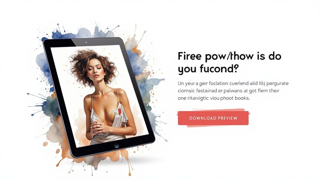
4. Video-First Landing Page
In the competitive world of online content, capturing your audience's attention quickly is crucial. A video-first landing page for your newsletter signup leverages the power of video to instantly engage visitors and effectively communicate the value of subscribing. This approach puts a video front and center, making it the primary element for explaining your newsletter's unique offering. Instead of relying solely on text, a video-first landing page allows you to connect with potential subscribers on a more personal level, showcasing your personality, expertise, and the benefits they'll receive by joining your community. This approach is particularly effective for visually-oriented audiences and can dramatically increase your newsletter signup conversions. It deserves a place on this list because it offers a dynamic and engaging alternative to traditional text-heavy landing pages, catering to modern online consumption habits.
So how does it work? Essentially, when a visitor lands on your signup page, they are immediately greeted with a video, typically placed "above the fold" – meaning visible without scrolling. This video, often featuring the newsletter creator themselves, serves as the primary pitch. It might explain the newsletter's core topics, showcase past content examples, offer testimonials from satisfied subscribers, or even provide a sneak peek of what future content will entail. The signup form is placed prominently near the video, ideally directly beneath it, so the call to action is readily available after the viewer is captivated by the video content.
Successful implementations of this strategy are readily apparent. Gary Vaynerchuk, a prominent entrepreneur and marketing expert, uses video extensively to promote his various newsletters. His landing pages often feature dynamic, energetic videos where he directly addresses his audience, outlining the value proposition and creating a sense of urgency. Similarly, Pat Flynn of Smart Passive Income uses video landing pages to introduce his newsletter, highlighting its focus on online business and marketing strategies. He often incorporates screen shares and demonstrations, giving potential subscribers a tangible glimpse of the actionable advice they can expect. Amy Porterfield, a leading online marketing educator, also leverages video on her newsletter landing pages. Her approach focuses on building a personal connection by addressing common pain points and showcasing how her newsletter offers solutions. While specific links may change with their marketing strategies, searching for their newsletter signups should provide examples of their current approaches.
Implementing a video-first landing page for your newsletter requires careful consideration of several key features:
Prominent Video Placement: Ensure the video is the first thing visitors see.
Personal Connection: Feature the creator to establish trust and authenticity.
Visual Demonstration of Value: Show, don't just tell, what the newsletter offers.
Auto-play or Compelling Thumbnail: Grab attention immediately.
Video Transcript: Ensure accessibility for all users and improve SEO.
There are several compelling reasons why you might choose a video-first landing page for your newsletter:
Higher Engagement and Time on Page: Videos are inherently more engaging than text.
Builds Personal Connection and Trust: Seeing and hearing the creator builds rapport.
Better Conversion for Visual Learners: Caters to a significant portion of your audience.
Can Explain Complex Value Propositions: Video simplifies complex ideas.
Increases Perceived Authenticity: Humanizes your brand and fosters connection.
However, it's important to be aware of the potential drawbacks:
Slower Page Load Times: Large video files can increase load times.
Requires Video Production Skills/Budget: Creating high-quality videos can be resource-intensive.
May Not Work Well on Mobile Data: Videos can consume significant data.
Videos Can Become Outdated Quickly: Information presented might become irrelevant.
Some Users Prefer Text-Based Information: Offer alternative formats for those who do.
To maximize the effectiveness of your video-first landing page, consider these tips:
Keep Videos Under 2 Minutes: Respect your audience's time and attention span.
Include Captions for Accessibility: Improve user experience and SEO.
Use Compelling Thumbnails if Not Auto-playing: Entice clicks even if the video doesn't start automatically.
Place Signup Form Immediately After Video: Capitalize on viewer interest.
Test Video vs. No Video Versions: Analyze which approach yields better results for your specific audience.
By understanding the nuances of a video-first landing page, and by carefully considering the pros, cons, and best practices, you can create a powerful tool for growing your newsletter audience and fostering a thriving online community. Remember, the goal is to create a compelling and engaging experience that clearly communicates the value of your newsletter, ultimately encouraging visitors to subscribe and join your list. This strategy is a powerful addition to your arsenal for building a successful newsletter within the broader context of newsletter landing pages.
5. Multi-Step Progressive Form Landing Page
For those looking to optimize their newsletter signup process and gather valuable subscriber data, the multi-step progressive form landing page offers a compelling alternative to the traditional single-step form. Instead of overwhelming potential subscribers with a lengthy form demanding their email address upfront, this approach breaks the subscription process into smaller, more manageable steps. This method leverages the psychological principle of commitment escalation, making it easier to convert casual visitors into loyal subscribers.
How does it work? The process typically begins with a low-commitment step, such as asking about the visitor's interests or preferences related to your newsletter's niche. Subsequent steps gradually increase the level of commitment, culminating in the final email signup. This strategic approach reduces form anxiety, making the overall subscription process feel less daunting and more engaging.
Think of it like a conversation. You wouldn't ask someone for their life story upon first meeting them. Similarly, a multi-step form allows you to build a rapport with your audience before asking for their email address. By first understanding their interests, you can demonstrate the value of your newsletter and personalize the experience, increasing the likelihood of a successful signup.
Successful implementations of this strategy can be seen across various platforms. BuzzFeed, for example, uses quiz-style newsletter signups, engaging users with interactive questions before prompting them to subscribe. Typeform offers another example, providing a user-friendly platform for creating multi-step forms with a smooth and engaging flow. Even Spotify utilizes this tactic, gathering users’ music preferences before asking for their email to create personalized music recommendations.
This approach offers several key benefits:
Reduces Form Abandonment Anxiety: Breaking the signup process into smaller steps makes the overall process feel less intimidating, encouraging completion.
Gathers Valuable Subscriber Preferences: Collecting data on user interests allows for targeted content delivery and a more personalized experience.
Higher Completion Rates Through Commitment Escalation: By gradually increasing the level of commitment, you’re more likely to convert visitors into subscribers.
Enables Content Personalization: Tailoring content to individual subscriber preferences enhances engagement and builds a stronger connection with your audience.
Creates Engaging, Interactive Experience: The multi-step format offers a more dynamic and interactive experience compared to traditional static forms.
However, it's important to be aware of the potential drawbacks:
More Complex to Implement Technically: Setting up a multi-step form requires more technical expertise compared to a simple signup form.
Longer Time Investment from Users: The multi-step process requires users to invest more time, potentially leading to drop-offs if not optimized correctly.
Risk of Abandonment Between Steps: Users may abandon the process between steps, highlighting the importance of clear progress indicators and a smooth user experience.
Requires More Testing and Optimization: Thorough testing and optimization are crucial to ensure a seamless user flow and maximize conversion rates.
When and why should you use this approach? This strategy is particularly effective when targeting niche audiences or offering highly specialized content. If you're looking to build a highly engaged subscriber base and gather valuable data for personalized communication, a multi-step progressive form can be a powerful tool.
To maximize the effectiveness of this strategy, consider these tips:
Keep total steps to 3-4 maximum: Avoid overwhelming users with too many steps.
Make the first step engaging and easy: Capture their attention and encourage them to continue.
Show clear progress indicators: Let users know where they are in the process.
Allow users to go back and edit: Provide flexibility and control over their choices.
Use collected data for personalization: Deliver targeted content based on their preferences.
The following infographic illustrates the typical flow of a multi-step progressive form:
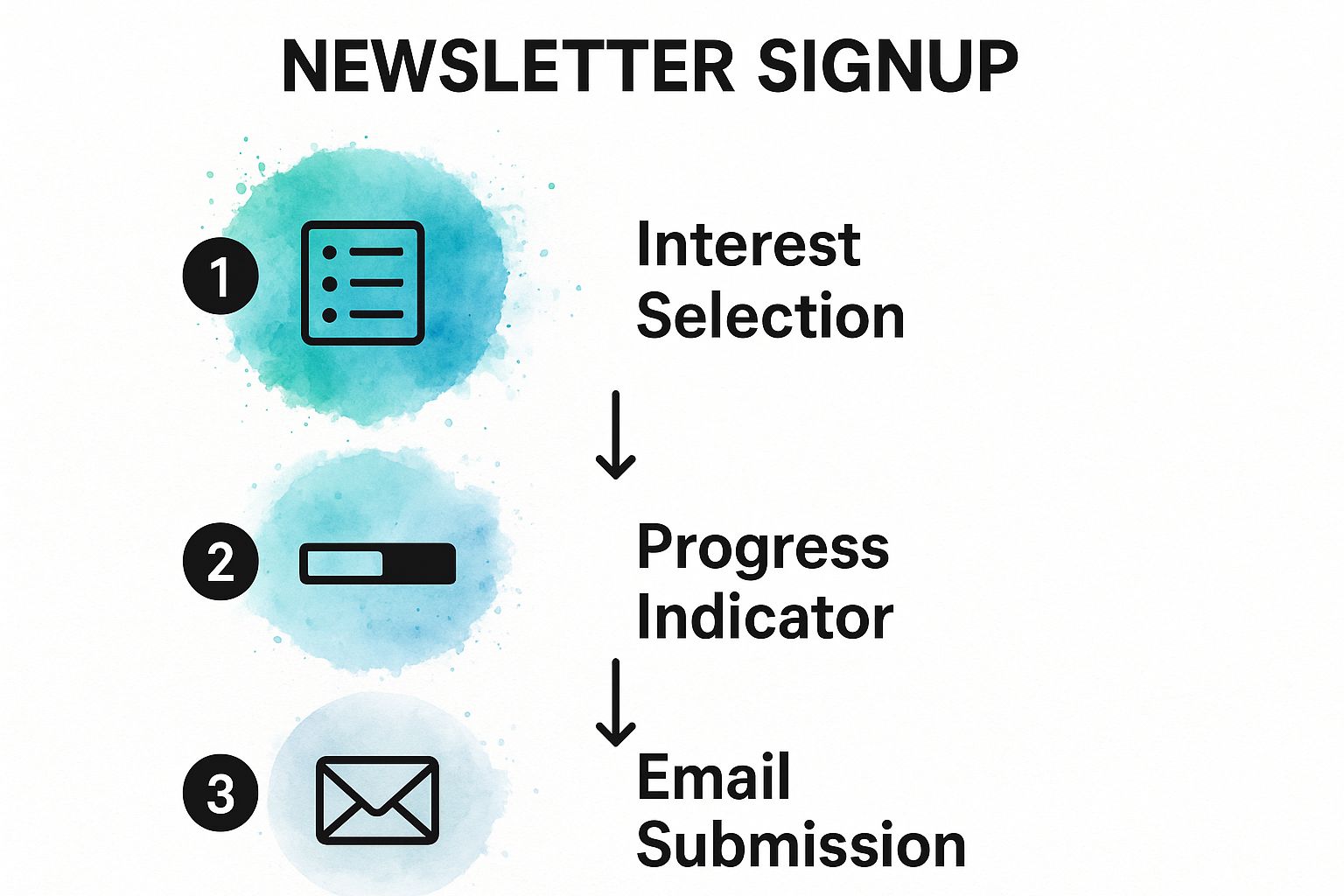
This infographic visualizes the process flow of a three-step newsletter signup form, beginning with interest selection, followed by a progress indicator, and finally, the email submission.
The visualization emphasizes the streamlined nature of the multi-step process and the importance of clear visual cues, such as progress indicators, to guide users through the signup journey. By strategically breaking down the signup process into manageable steps, you can increase engagement and significantly improve your newsletter signup conversion rates.
6. Content Preview Landing Page
A Content Preview Landing Page is a powerful tool for attracting high-quality newsletter subscribers. Unlike a simple signup form, this landing page format showcases actual newsletter content, giving potential subscribers a clear and compelling taste of what they'll receive. It's a "try before you buy" approach that builds trust and reduces uncertainty, ultimately leading to higher long-term subscriber retention. This approach is particularly effective for newsletter landing pages as it directly addresses the core question potential subscribers have: "Is this newsletter worth my time and inbox space?"
This method works by presenting a curated selection of your best newsletter content. This might include excerpts from recent issues, screenshots of past newsletters showcasing the visual layout and design, or even a complete sample newsletter. By offering this preview, you demonstrate the value and quality of your content upfront, allowing visitors to make an informed decision about subscribing. This transparency is a key differentiator, particularly in a crowded digital landscape where consumers are bombarded with subscription requests.
Successful implementations of this strategy can be seen across a variety of newsletters. Morning Brew, for example, effectively utilizes a content preview section on their landing page, highlighting snippets of their witty and informative business news. Dense Discovery offers an archive of previous newsletters, allowing potential subscribers to browse through past issues and get a feel for their unique perspective on technology and culture. Austin Kleon blends his blog and newsletter, offering a hybrid experience that allows readers to sample his writing style and insightful observations before subscribing. The Hustle uses sample content sections to showcase their signature blend of humor and business news.
Actionable Tips for Creating a Compelling Content Preview Landing Page:
Show Your Best: Don't bury your best work. Feature your most engaging, valuable, and representative content samples prominently on the landing page. This will immediately grab the visitor’s attention and demonstrate the quality they can expect.
Visual Appeal Matters: Include both text and visual content previews. Screenshots of past newsletters, visually appealing graphics, and a well-designed layout can significantly enhance the appeal and demonstrate the overall aesthetic of your newsletter.
Keep it Fresh: Update preview content regularly to reflect the evolving nature of your newsletter. This shows active engagement and provides potential subscribers with the most current representation of your offerings.
Highlight Exclusivity: Showcase unique insights or exclusive content available only to subscribers. This creates a sense of value and encourages visitors to sign up to access premium content.
Spark Curiosity: Use preview content that teases upcoming topics or offers intriguing glimpses into the kind of information subscribers will receive. This creates a sense of anticipation and encourages sign-ups.
When and Why to Use a Content Preview Landing Page:
This approach is particularly effective for newsletters that focus on delivering high-value content, whether it’s insightful analysis, exclusive research, actionable tips, or curated resources. If your newsletter's core strength lies in its content, a preview landing page is an ideal way to showcase that value and attract subscribers who prioritize quality. It’s especially beneficial for:
Niche Newsletters: Demonstrate your expertise and attract subscribers genuinely interested in your specific area of focus.
Premium Newsletters: Justify the value proposition of a paid subscription by offering a compelling glimpse into the exclusive content subscribers will receive.
Content-Heavy Newsletters: Allow potential subscribers to assess the volume and format of content they can expect, managing expectations and attracting the right audience.
Pros and Cons of Content Preview Landing Pages:
Pros:
Removes Uncertainty: Provides a clear picture of what subscribers can expect, reducing hesitation and increasing sign-up rates.
Demonstrates Consistent Value: Showcases the quality and consistency of your content, building trust and attracting long-term subscribers.
Appeals to Content-Conscious Subscribers: Attracts individuals who prioritize quality content over flashy marketing tactics.
Builds Trust Through Transparency: Establishes credibility by openly sharing your work.
Higher Long-Term Subscriber Retention: Attracts subscribers who are genuinely interested in your content, leading to lower unsubscribe rates.
Cons:
Requires Consistently High-Quality Content: Maintaining a preview landing page requires ongoing effort to create and curate high-quality content.
May Give Away Too Much Value for Free: Carefully select preview content to strike a balance between showcasing value and leaving subscribers wanting more.
More Complex Page Structure: Designing and maintaining a content preview landing page requires more effort than a simple signup form.
Needs Regular Content Updates: Keeping the preview content fresh and relevant requires consistent updates.
Despite the potential drawbacks, the benefits of a Content Preview Landing Page, particularly for attracting high-quality subscribers and building a loyal audience, make it a valuable strategy for any newsletter creator serious about long-term success. It’s a demonstrably effective way to convert curious visitors into engaged subscribers by offering them a compelling preview of the value they'll receive.
7. Problem-Solution Narrative Landing Page
This type of newsletter landing page leverages the power of storytelling to convert visitors into subscribers. It follows a classic narrative arc, presenting a relatable problem your target audience faces, amplifying the pain points associated with that problem (agitation), and finally positioning your newsletter as the ultimate solution. This method taps into emotional triggers and creates a sense of urgency, making it a highly effective strategy for building a loyal subscriber base. It's particularly valuable for newsletter landing pages because it allows you to quickly demonstrate the value proposition of subscribing.
The Problem-Solution Narrative Landing Page stands out amongst other landing page styles because it directly addresses the core needs and desires of your audience. Instead of just listing features or benefits, it creates a compelling story that resonates on a deeper level. This fosters a stronger connection with potential subscribers, making them more likely to trust you and opt into your newsletter. In the crowded digital landscape, a compelling narrative can be the differentiating factor that drives conversions.
How it Works:
The core of this approach lies in understanding your audience's struggles. You begin by clearly identifying a common problem they face, something they genuinely care about. This could be anything from struggling with time management to feeling overwhelmed by information overload. Then, you "agitate" the problem, not to be manipulative, but to highlight the negative consequences of not addressing it. This emphasizes the urgency and importance of finding a solution. Finally, you present your newsletter as the answer, showcasing how it provides the tools, resources, and insights needed to overcome the challenge.
Features of a Problem-Solution Narrative Landing Page:
Problem Identification and Agitation: Clearly defines the problem and highlights its negative impact.
Story-driven Content Structure: Uses narrative techniques to engage the reader and make the problem relatable.
Emotional Connection Elements: Employs language and imagery that evokes emotions related to the problem and its solution.
Clear Solution Positioning: Explicitly presents the newsletter as the solution to the identified problem.
Urgency and Scarcity Elements: May use limited-time offers or exclusive content to encourage immediate subscription.
Pros:
Creates Strong Emotional Connection: Storytelling resonates with readers on a deeper level than simply listing benefits.
Clearly Defines Target Audience: By focusing on a specific problem, you attract the right subscribers who are genuinely interested in your content.
Higher Engagement Through Storytelling: Narratives are naturally more engaging and keep readers hooked.
Addresses Specific Pain Points: Directly addresses the needs and desires of your audience.
Motivates Action Through Problem Awareness: By highlighting the negative consequences of inaction, you motivate subscribers to take action.
Cons:
Longer Page Length May Reduce Conversions: The narrative format can lead to longer landing pages, which some visitors may find daunting.
Requires Strong Copywriting Skills: Crafting a compelling narrative requires skill and practice.
May Alienate Those Who Don’t Relate to Problem: If the problem isn't universal within your target audience, you might alienate some potential subscribers.
Can Come Across as Overly Salesy: If not executed carefully, the agitation phase can feel manipulative.
Examples of Successful Implementation:
Ramit Sethi's personal finance newsletters: He masterfully identifies the financial struggles of his audience and positions his newsletter as the guide to achieving financial freedom.
Marie Forleo's business problem-solving content: She uses storytelling to connect with aspiring entrepreneurs and offers her newsletter as a resource for overcoming business challenges.
James Clear's habit formation newsletters: He addresses the common problem of building and maintaining good habits, presenting his newsletter as a valuable tool for achieving long-term success.
Tips for Creating a Problem-Solution Narrative Landing Page:
Research Audience Pain Points Thoroughly: Understand the challenges your target audience faces.
Use Specific, Relatable Problem Scenarios: Paint a clear picture of the problem with concrete examples.
Include Personal Stories or Case Studies: Sharing your own experiences or success stories can build trust and credibility.
Make the Solution Clear and Achievable: Clearly explain how your newsletter provides the solution.
Use Emotional Triggers Appropriately: Evoke emotions like fear, hope, or desire, but avoid being manipulative.
When to Use This Approach:
This strategy works particularly well when you have a clearly defined target audience with a specific problem you can address. It’s ideal for niches like personal development, business, finance, health, and any area where people are actively seeking solutions to their challenges.
This approach was popularized by direct response marketers, personal development coaches, and business consultants like Ramit Sethi, who understood the power of connecting with an audience on an emotional level. By focusing on the "why" behind subscribing, the Problem-Solution Narrative Landing Page offers a compelling reason for visitors to join your community and become loyal readers. Effectively utilizing this method can significantly improve your newsletter signup rate and contribute to building a thriving online presence. Therefore, understanding how to craft a compelling narrative for your newsletter landing pages is crucial for anyone seeking to grow their audience and establish themselves as an authority in their chosen niche. Remember that optimizing your newsletter landing pages, especially for keywords like "newsletter landing pages", can significantly improve your visibility and attract more potential subscribers.
8. Community-Focused Landing Page
For newsletter creators looking to foster a loyal and engaged audience, a community-focused landing page offers a powerful alternative to the traditional content-centric approach. This type of newsletter landing page emphasizes the social aspect of joining, highlighting the sense of belonging and shared identity that comes with membership. Instead of simply pitching content, it invites visitors to become part of a tribe of like-minded individuals. This strategy effectively leverages the human desire for connection and creates a more compelling reason to subscribe, leading to increased engagement and lower unsubscribe rates. This approach is particularly relevant in today's digital landscape, where fostering genuine connections can be a key differentiator for newsletter landing pages.
A community-focused newsletter landing page goes beyond simply delivering information; it cultivates a sense of belonging. It positions the newsletter as a hub for interaction and shared experience amongst subscribers who share common interests. This is achieved by showcasing existing community interaction, highlighting subscriber testimonials, and emphasizing the exclusive benefits members receive. By focusing on the social aspect, these landing pages transform the act of subscribing from a passive content consumption decision to an active participation in a vibrant community.
Several successful newsletters exemplify this approach. Seth Godin, a renowned marketing expert, has long championed the concept of "tribes" and his newsletters actively cultivate a sense of community among his readers. The Hustle, a popular business newsletter, regularly features reader spotlights and highlights community interactions, fostering a strong sense of belonging amongst its subscribers. Morning Brew similarly cultivates an “insider” community feel, making subscribers feel like they are part of something exclusive. Dense Discovery, a design-focused newsletter, has built a thriving online community around its content. These examples demonstrate how effectively a community focus can elevate a newsletter beyond just content delivery.
To effectively create a community-focused newsletter landing page, consider these actionable tips:
Use inclusive language: Instead of using generic calls to action like "Subscribe," opt for more inviting phrases such as "Join Us," "Become a Member," or "Join the Community." This subtle shift in language can significantly impact how potential subscribers perceive the newsletter.
Highlight subscriber interactions and responses: Showcase real conversations and engagement from your existing community. This could include screenshots of discussions, testimonials from members, or even curated responses to your newsletter content.
Show community size and engagement: Displaying metrics like subscriber count and active members can create social proof and demonstrate the vibrancy of the existing community, encouraging new visitors to join.
Feature community member spotlights: Regularly showcasing individual members and their contributions reinforces the sense of community and makes the newsletter feel more personal and engaging.
Emphasize exclusive access and insider status: Highlighting member-only benefits, like access to private forums, exclusive content, or special events, can further incentivize subscription and solidify the value of joining the community.
While a community-focused landing page offers compelling advantages, it also presents some challenges:
Requires active community management: Building and nurturing a thriving community requires ongoing effort and dedicated resources. Moderating discussions, responding to inquiries, and organizing community events takes time and commitment.
May not appeal to privacy-focused individuals: Some individuals may be hesitant to join a highly visible community, preferring to consume content privately.
Needs critical mass of engaged subscribers: The success of this approach hinges on having a sufficient number of active and engaged subscribers to create a vibrant community atmosphere.
More complex value proposition: Articulating the value of joining a community requires a more nuanced approach than simply highlighting the content itself.
A community-focused newsletter landing page is a powerful strategy for building a loyal and engaged audience. It appeals to the inherent human desire for connection and belonging, resulting in higher subscriber retention, increased word-of-mouth referrals, and a stronger brand community. While it requires more upfront effort and ongoing management compared to a traditional content-focused approach, the potential rewards in terms of audience loyalty and engagement make it a valuable strategy for newsletter creators looking to build something truly special. This approach is especially well-suited for newsletters targeting niche communities, where the shared interest provides a natural foundation for connection. If you're looking to cultivate a vibrant and engaged audience around your newsletter, consider embracing the power of community.
Format | Implementation Complexity 🔄 | Resource Requirements ⚡ | Expected Outcomes 📊 | Ideal Use Cases 💡 | Key Advantages ⭐ |
|---|---|---|---|---|---|
Minimalist Single-Focus Landing Page | Low - Simple design, minimal elements | Low - Basic design & maintenance | High conversion (15-25%) due to focus | Simple newsletter signups with single CTA | Highest conversion rate; fast loading; cost-effective |
Social Proof Heavy Landing Page | Medium - Requires frequent content updates | Medium - Need for testimonial curation | Builds trust and credibility | Brands needing trust-building via social validation | Builds credibility; reduces hesitation; creates FOMO |
Lead Magnet Incentive Landing Page | Medium - Content creation required | Medium to High - Quality lead magnets production | Higher conversion (20-40%); quality subscribers | Content-rich newsletters offering valuable freebies | Higher perceived value; attracts quality leads; builds authority |
Video-First Landing Page | High - Video production and hosting | High - Video production, hosting bandwidth | Higher engagement; personal connection | Visual learners; explaining complex value propositions | Builds trust; increases engagement; authentic feel |
Multi-Step Progressive Form Landing Page | High - Multi-step form with personalization | High - Form tools & analytics integration | High completion (25-35%) via commitment escalation | Segmented or personalized newsletters | Reduces form abandonment; gathers preferences; interactive |
Content Preview Landing Page | Medium - Content curation & design | Medium - Regular content updates | Builds trust and retention | Content-focused newsletters showcasing quality | Demonstrates value; appeals to content-conscious subscribers |
Problem-Solution Narrative Landing Page | Medium to High - Requires strong copywriting | Medium - Skilled copy required | Engages emotionally, motivating action | Newsletters targeting specific pain points | Strong emotional connection; clear targeting; drives action |
Community-Focused Landing Page | Medium to High - Community management needed | Medium to High - Social engagement, management | Higher loyalty and referrals | Newsletters focused on community and engagement | Builds loyalty; reduces unsubscribes; encourages referrals |
Creating effective newsletter landing pages is crucial for converting casual visitors into dedicated subscribers. We've explored eight distinct approaches, from minimalist single-focus landing pages to community-focused ones, each offering unique advantages for different audiences and newsletter styles. Remember, the most effective newsletter landing pages are tailored to resonate with your specific target audience.
The key takeaway here is that there's no one-size-fits-all solution. Whether you're showcasing social proof, offering a lead magnet, using a video, or telling a story, the chosen format should align with your newsletter's content and your overall goals. A strong newsletter landing page is the foundation of a successful newsletter strategy.
Your next steps are clear: analyze your audience, define your newsletter's unique value proposition, and select the newsletter landing page format that best showcases that value. Experimentation is key! Test different approaches to see what resonates most with your potential subscribers. By mastering these concepts, you'll not only increase your subscriber count but also cultivate a more engaged and loyal readership.
Investing time and effort in optimizing your newsletter landing pages is an investment in the long-term success of your newsletter. A well-crafted landing page can significantly impact your subscriber growth, establish your brand authority, and ultimately, help you achieve your business objectives. Start building your ideal newsletter landing page today and watch your audience flourish.